
Tag: D3.js
-
d3.nest
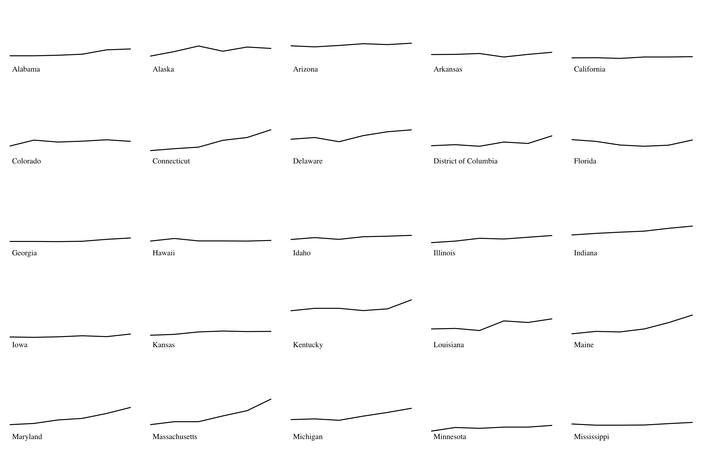 Read more…: d3.nest
Using d3.nest to transform stacked data.
-
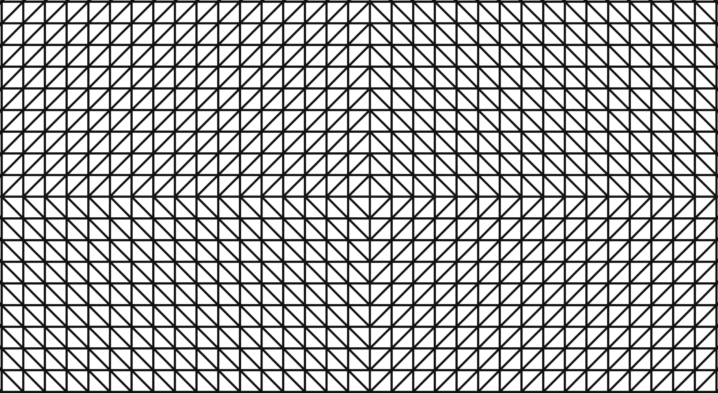
Sol LeWitt’s Wall Drawings 852 and 853 with D3.js
 Read more…: Sol LeWitt’s Wall Drawings 852 and 853 with D3.js
Learning all about D3.js’s area and sorting functions to implement Sol LeWitt’s Wall Drawings 852 and 853 with random generation.
-
Make Your Own Sol LeWitt 614!
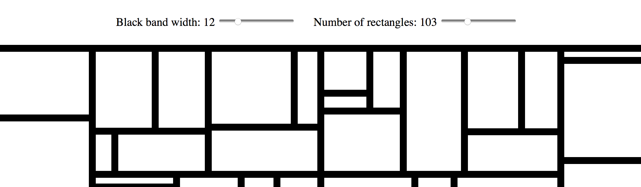 Read more…: Make Your Own Sol LeWitt 614!
I took my implementation of Sol LeWitt’s Wall Drawing 614 using a D3.js Treemap and made it possible for users to change the number of rectangles and the width of the bands. Now you can make your own!
-
Sol LeWitt’s Wall Drawing 614 with D3.js Treemap and Randomization
 Read more…: Sol LeWitt’s Wall Drawing 614 with D3.js Treemap and Randomization
Implementing Sol LeWitt’s Wall Drawing 614 with D3.js Treemap and randomization.
-
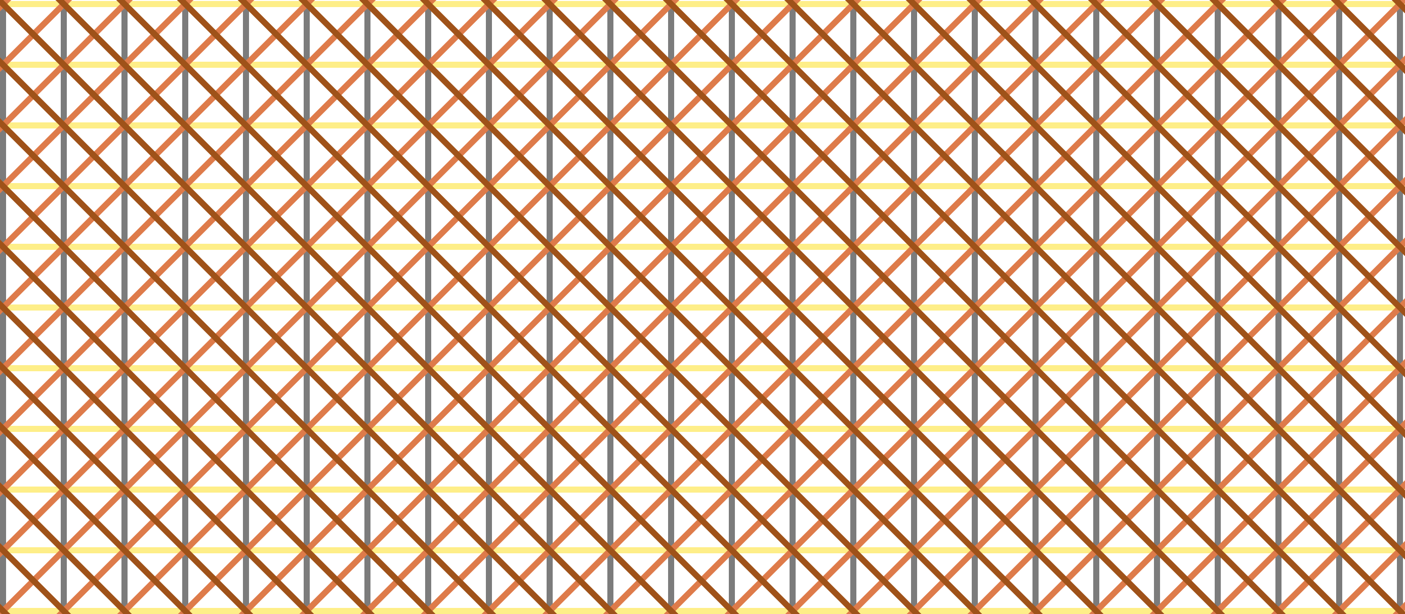
Sol LeWitt’s Wall Drawing 289 with D3.js Transitions
 Read more…: Sol LeWitt’s Wall Drawing 289 with D3.js Transitions
Implementing Sol LeWitt’s Wall Drawing 289 with D3.js transitions, randomization, and responsiveness.
-
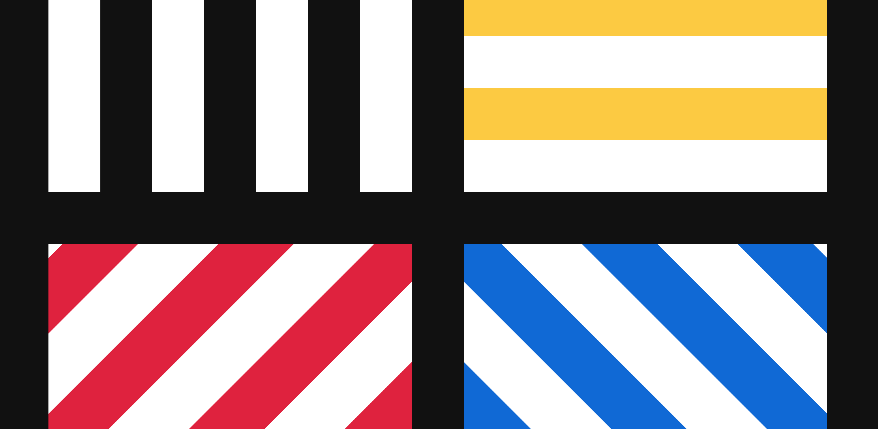
Sol LeWitt’s Wall Drawing 86 with D3.js Transitions
 Read more…: Sol LeWitt’s Wall Drawing 86 with D3.js Transitions
Implementing Sol LeWitt’s Wall Drawing 86 with D3.js transitions, randomization, and responsiveness.
-
Sol LeWitt’s Wall Drawing 87 with D3.js Transitions
 Read more…: Sol LeWitt’s Wall Drawing 87 with D3.js Transitions
Exploring Sol LeWitt’s Wall Drawing 87 with D3.js transitions.
-
Sol LeWitt’s Wall Drawing 391 with D3.js
 Read more…: Sol LeWitt’s Wall Drawing 391 with D3.js
Design decisions and notes I made in implementing Sol LeWitt’s Wall Drawing 391 with D3.js.
-
Sol LeWitt’s Wall Drawing 11 with D3.js
 Read more…: Sol LeWitt’s Wall Drawing 11 with D3.js
Design decisions and notes I made while implementing Sol LeWitt’s Wall Drawing 11 with D3.js.
-
Sol LeWitt’s Wall Drawing 56 with D3.js
 Read more…: Sol LeWitt’s Wall Drawing 56 with D3.js
My first attempt at implementing Sol LeWitt’s work on the web! Here are the design decisions and notes I made while implementing Sol LeWitt’s Wall Drawing 56 with D3.js.
-
Smooth Pie Chart Transitions with D3.js
 Read more…: Smooth Pie Chart Transitions with D3.js
This tutorial shows how to make smooth transitions in a pie chart using d3.interpolate.
-
Let’s Update a Pie Chart in Realtime with D3.js
 Read more…: Let’s Update a Pie Chart in Realtime with D3.js
This tutorial builds on previous work and updates a pie chart in realtime.
-
Let’s Make a Pie Chart with D3.js
 Read more…: Let’s Make a Pie Chart with D3.js
Here I learn the basics of making a pie chart with D3.js
-
Let’s Make a Grid with D3.js
 Read more…: Let’s Make a Grid with D3.js
This tutorial is a way to apply what I learned about data joins, click events, and selections in D3.js. Along the way I learned about building arrays.
-
Fun with Circles in D3
 Read more…: Fun with Circles in D3
Learning D3 by playing with circles
-
D3 Intro and Joins Notes
 Read more…: D3 Intro and Joins Notes
Notes from the D3js.org Introduction and Thinking With Joins
-
Relearning D3.js
 Read more…: Relearning D3.js
How I’m relearning D3.js.
-
Responsive D3.js bar chart with labels
 Read more…: Responsive D3.js bar chart with labels
TIL how to make