
Concord
- cmyk:
- 44 36 33 1 1.00
- rgba:
- 124 124 124 1.00
- hex:
- #7C7C7C


It’s not just the balloons at the Macy’s Thanksgiving Day Parade that are inflated.
Each year the American Farm Bureau Federation collects an informal price survey for a typical Thanksgiving dinner. The shopping list has remained the same for the past 31 years: turkey, bread stuffing, sweet potatoes, rolls with butter, peas, cranberries, a veggie tray, pumpkin pie with whipped cream, and coffee and milk, all to feed a family of 10.
At first glance, it seems like the price of food has trended upward since 1986. Once you adjust for inflation, however, you get a different story. The inflation-adjusted price has stayed relatively flat over time with minor fluctuations. The purchasing power of our currency in circulation has gone down over time, driving up the price of goods.
As Mark Perry points out, this is no reason for despair. The average hourly wage of the American worker has increased steadily, making Thanksgiving more affordable than ever. That is something to be thankful for this year.
The data for this chart was collected by the American Farm Bureau Federation. I adjusted this price data for inflation using the BLS’s CPI Inflation Calculator. The chart was built using Chart.js.
I retooled my original 2014 version. I paid closer attention to colors and made this one responsive. I think it is a big improvement!
This was also published over at FEE’s Anything Peaceful blog.

Aren’t familiar with Sol LeWitt or his art? Read this.
I had an insight while going through the D3.js documentation to find a solution to another piece: d3.area() with a highly curved fit line isn’t that different from wall drawings 852 and 853! By the way, 852 and 853 are actually distinct pieces, though they are often grouped together into one display like the one at MASSMoCA. I worked on the solution to 852 first, then modified it to make 853:
Wall Drawing 852: A wall divided from the upper left to the lower right by a curvy line; left: glossy yellow; right: glossy purple.
Wall Drawing 853: A wall bordered and divided vertically into two parts by a flat black band. Left part: a square is divided vertically by a curvy line. Left: glossy red; right: glossy green; Right part: a square is divided horizontally by a curvy line. Top: glossy blue; bottom: glossy orange.
Here are previews of 852 and 853 respectively:


Open my D3 implementation of Wall Drawing 852 in a new window →
Open my D3 implementation of Wall Drawing 853 in a new window →
They are also available as blocks: 852 853
So much of implementing these drawings with D3.js rely on making a solid, usable data set to join elements with. (After all, D3 stands for data-driven-documents.) Creating these data sets is where I spend most of my time. Once I’ve created them, everything else follows pretty quickly.
Since d3.area() makes an area graph with given points, I had to create a data set of points. I wanted the start and end points to be defined with random (but constrained) points in the middle. Here is what I came up with for 852:
var ww = window.innerWidth, wh = window.innerHeight; function getRandomArbitrary(min, max) { return Math.random() * (max - min) + min; } function lineData() { var data = new Array(); for (var point = 0; point < 5; point++) { var x = getRandomArbitrary(ww/10, ww-ww/10); // Constrains within the middle 80% var y = getRandomArbitrary(wh/10, wh-wh/10); data.push({ x: x, y: y }) } // Starting point upper left data.push({ x: 0, y: 0 }); // End point lower right data.push({ x: ww, y: wh }) return data; }For 853, things were a little trickier since the left is oriented vertically:
var ww = window.innerWidth, wh = window.innerHeight - 80, halfwidth = ww/2 - 60; function getRandomArbitrary(min, max) { return Math.random() * (max - min) + min; } function fillLeft() { var data = new Array(); for (var point = 0; point < 3; point++) { var x = getRandomArbitrary(halfwidth/10, halfwidth-halfwidth/10); // Keeps within the middle 80% var y = getRandomArbitrary(wh/10, wh-wh/10); data.push({ x: x, y: y }) } data.push({ x: halfwidth/2, y: 0 }); data.push({ x: halfwidth/2, y: wh }) return data; } function fillRight() { var data = new Array(); for (var point = 0; point < 3; point++) { var x = getRandomArbitrary(halfwidth/10, halfwidth-halfwidth/10); // Keeps within the middle 80% var y = getRandomArbitrary(wh/10, wh-wh/10); data.push({ x: x, y: y }) } data.push({ x: 0, y: wh/2 }); data.push({ x: halfwidth, y: wh/2 }) return data; } One of the most important things to note about d3.area() is that you must sort your data sets (by x if the chart is horizonal, y if vertical) before passing them to the function. Otherwise you end up with something like this because the values are out of order:

D3 has selection.sort() built in, but you also need to pass a function telling it how to sort:
.sort(function(a,b) { return +a.x - +b.x; }) // Sorting by x ascending .sort(function(a,b) { return +a.y - +b.y; }) // Sorting by y ascendingMost area charts tend to be horizontal, and nearly all examples you can find are structured in this way. You need to pass .x, .y0, and .y1:
var area = d3.area() .x(function(d) { return d.x; }) .y0(window.innerHeight) .y1(function(d) { return d.y; }) .curve(d3.curveBasis);If you are switching to a vertical orientation, you instead need to pass .y, .x0, and .x1:
var areaLeft = d3.area() .x0(0) .x1(function(d) { return d.x; }) .y(function(d) { return d.y; }) .curve(d3.curveBasis);I played with a number of curve functions and a number of points to see how they compared to traditional interpretations of Sol LeWitt’s pieces:
I eventually settled on curveBasis for both pieces. It creates the smoothest curving line with the given random points, which produces results similar to the curved lines in Sol’s earlier work. curveCatmullRom was my second choice, but occasionally produced harsh concave regions.
For the larger standalone piece (852) I used 7 total points, including the end points. For 853, which consists of two different curves, I used 5 points each since the widths were smaller.
When you resize the screen, the divs gets destroyed and then rebuilt based on the new screen size. Here is the function I use to handle that. It is the same thing I used on 86 and on my Jekyll posts heatmap calendar. I wrapped the D3 instructions in its own function, called that function on first load, then wrote a function to destroy the node divs when the screen is resized and reexecute the D3 instructions after the screen resize ends. I’m sure it can be done with regular javascript, but jQuery makes this kind of thing fast and easy:
// run on first load sol852(); $(window).resize(function() { if(this.resizeTO) clearTimeout(this.resizeTO); this.resizeTO = setTimeout(function() { $(this).trigger('resizeEnd'); }, 500); }); //resize on resizeEnd function $(window).bind('resizeEnd', function() { d3.selectAll("div.node").remove(); sol852(); });Detail shot of the version on display at MASSMoCA:

It is also available as a block.
Here are Sol’s original instructions for Wall Drawing 614:
Wall Drawing 614: Rectangles formed by 3-inch (8 cm) wide India ink bands, meeting at right angles.
For the technical details of making the drawing itself, check out my post on it. This post focuses on rebuilding the tool based on user input.
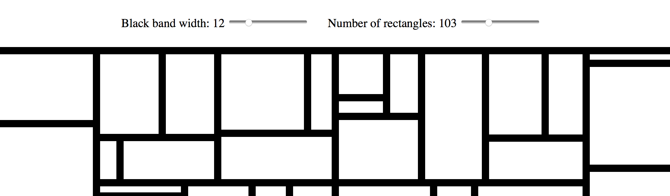
I used a form, a range input, an output, and some in-line JavaScript to power the sliders and display their values in real-time:
Black band width: type="range" name="paddingInput" id="paddingInputId" value="15" min="1" max="50" oninput="paddingOutputId.value = paddingInputId.value"> name="paddingOutput" id="paddingOutputId">15px /> Number of rectangles: type="range" name="rectInput" id="rectInputId" value="40" min="5" max="300" oninput="rectOutputId.value = rectInputId.value"> name="rectOutput" id="rectOutputId">40 Live example:
A set a variable to the element I wanted to access, then I called the .value of that element in my functions. (See the post on 614 for more info about these functions.)
var padding = document.getElementById("paddingInputId"); var rectNumber = document.getElementById("rectInputId"); function treeData() { var obj = {name: "rect"}; var children = []; for (var row = 0; row < rectNumber.value; row++) { children.push({id: row, value: getRandomArbitrary(60, 1000)}) } obj['children'] = children; return obj; } var treemap = d3.treemap() .size([width, height]) .padding(padding.value) .round(true) .tile(d3.treemapBinary);Similar to rebuilding on screen resize in the original version, I detect when there is a change in one of the inputs and then call a function to remove the divs and rebuild the treemap based on the inputs. jQuery makes this kind of thing fast and easy:
$( "#paddingInputId" ).change(function() { d3.selectAll("div.node").remove(); sol614(); }); $( "#rectInputId" ).change(function() { d3.selectAll("div.node").remove(); sol614(); });Want to dig in a little further? Check out my implementation and view source. All of the specs are there.

Aren’t familiar with Sol LeWitt or his art? Read this.
Wall Drawing 614: Rectangles formed by 3-inch (8 cm) wide India ink bands, meeting at right angles.
Here is a preview:

Open my D3 implementation of Wall Drawing 614 in a new window →
It is also available as a block.
d3.treemap().d3.treemapBinary. I liked the look of it the best.So much of implementing these drawings with D3.js rely on making a solid, usable data set to join elements with. (After all, D3 stands for data-driven-documents.) Creating these data sets is where I spend most of my time. Once I’ve created them, everything else follows pretty quickly. Here is the function that creates the underlying data set on this piece. I owe major props to Eric Davis on helping me figure this out. I was getting close, but nothing I made was accepted by treemap(). He helped me identify my issues, which included making this data set and then passing it to d3.hierarchy before passing it to treemap.
function getRandomArbitrary(min, max) { return Math.random() * (max - min) + min; } function treeData() { var obj = {name: "rect"}; var children = []; for (var row = 0; row < 40; row++) { children.push({id: row, value: getRandomArbitrary(60, 1000)}) } obj['children'] = children; return obj; }One of the difficulties of D3.js transitioning from v3 to v4 recently is that most of the tutorials you can find on the web no longer work. Thankfully Mike Bostock created a great example of a treemap with v4 that I referenced quite a bit.
After a few passes through the documentation and a call on my friend Eric Davis, we figured out how to pass data to d3.treemap():
d3.hierarchy.sum() on d3.hierarchy and sum the values before passing it to treemaptreemapSee below:
var width = window.innerWidth + 30, height = window.innerHeight + 30; var format = d3.format(",d"); var treemap = d3.treemap() .size([width, height]) .padding(15) .round(true) .tile(d3.treemapBinary); var tree = d3.hierarchy(tree); tree.sum(function(d) { return d.value; }); // always log for debugging! console.log(tree); treemap(tree); d3.select("body") .selectAll(".node") .data(tree.leaves()) .enter().append("div") .attr("class", "node") .attr("title", function(d) { return d.data.id; }) .style("left", function(d) { return d.x0 + "px"; }) .style("top", function(d) { return d.y0 + "px"; }) .style("width", function(d) { return d.x1 - d.x0 + "px"; }) .style("height", function(d) { return d.y1 - d.y0 + "px"; }) .style("background", "#fff");When you resize the screen, the divs gets destroyed and then rebuilt based on the new screen size. Here is the function I use to handle that. It is the same thing I used on 86 and on my Jekyll posts heatmap calendar. I wrapped the D3 instructions in its own function, called that function on first load, then wrote a function to destroy the node divs when the screen is resized and reexecute the D3 instructions after the screen resize ends. I’m sure it can be done with regular javascript, but jQuery makes this kind of thing fast and easy:
// run on first load sol614(); $(window).resize(function() { if(this.resizeTO) clearTimeout(this.resizeTO); this.resizeTO = setTimeout(function() { $(this).trigger('resizeEnd'); }, 500); }); //resize on resizeEnd function $(window).bind('resizeEnd', function() { d3.selectAll("div.node").remove(); sol614(); });Want to dig in a little further? Check out my implementation and view source. All of the specs are there.
Detail shot of the version on display at MASSMoCA:

Another shot of the version on display at MASSMoCA:

If you like this, I also made a version that you can customize. Check it out.

Aren’t familiar with Sol LeWitt or his art? Read this.
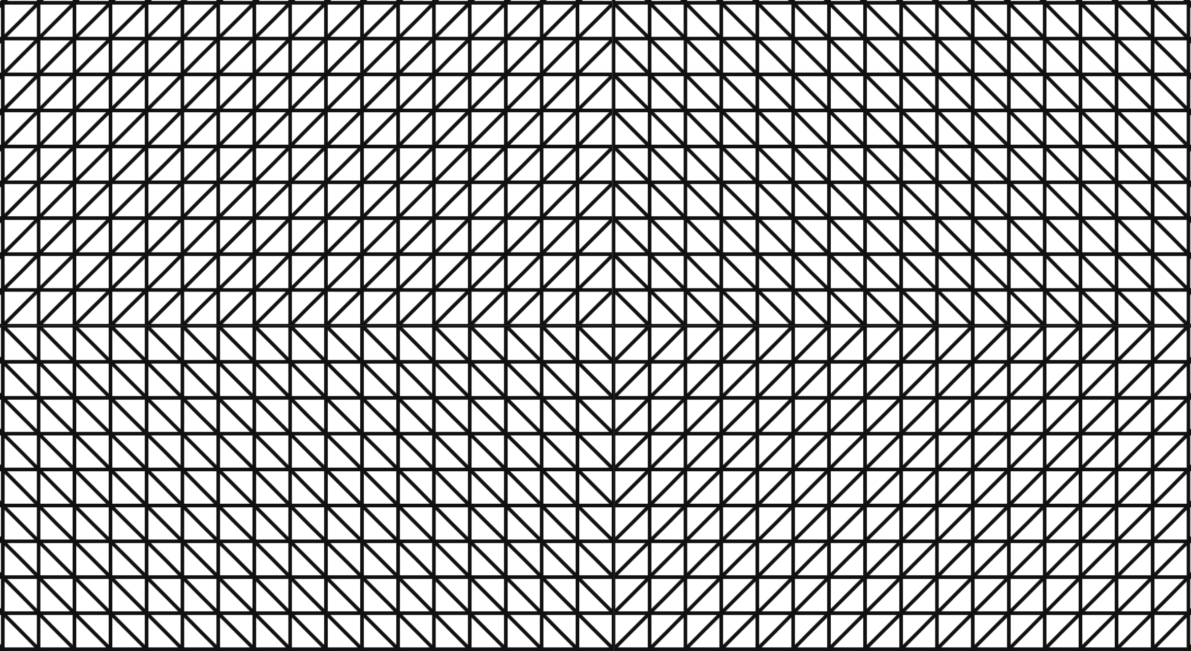
Wall Drawing 289: A 6-inch (15 cm) grid covering each of the four black walls. White lines to points on the grids. Fourth wall: twenty-four lines from the center, twelve lines from the midpoint of each of the sides, twelve lines from each corner. (The length of the lines and their placement are determined by the drafter.)
Here is a gfycat preview:
Open my D3 implementation of Wall Drawing 289 in a new window →
It is also available as a block.
So much of implementing these drawings with D3.js rely on making a solid, usable data set to join elements with. (After all, D3 stands for data-driven-documents.) Creating these data sets is where I spend most of my time. Once I’ve created them, everything else follows pretty quickly. Here is the function I wrote to create the underlying data set on this piece:
function getRandomArbitrary(min, max) { return Math.round(Math.random() * (max - min) + min); } function lineData() { var data = new Array(); var id = 1; var ww = window.innerWidth; var wh = window.innerHeight; var numLines = 12; // iterate for cells/columns inside rows for (var center = 0; center < numLines * 2; center++) { data.push({ id: id, class: "center", x1: ww/2, y1: wh/2, x2: getRandomArbitrary(0, ww), y2: getRandomArbitrary(0, wh) }) id++; } for (var topleft = 0; topleft < numLines; topleft++) { data.push({ id: id, class: "topleft", x1: 0, y1: 0, x2: getRandomArbitrary(0, ww), y2: getRandomArbitrary(0, wh) }) id++; } for (var topright = 0; topright < numLines; topright++) { data.push({ id: id, class: "topright", x1: ww, y1: 0, x2: getRandomArbitrary(0, ww), y2: getRandomArbitrary(0, wh) }) id++; } for (var bottomright = 0; bottomright < numLines; bottomright++) { data.push({ id: id, class: "bottomright", x1: ww, y1: wh, x2: getRandomArbitrary(0, ww), y2: getRandomArbitrary(0, wh) }) id++; } for (var bottomleft = 0; bottomleft < numLines; bottomleft++) { data.push({ id: id, class: "bottomleft", x1: 0, y1: wh, x2: getRandomArbitrary(0, ww), y2: getRandomArbitrary(0, wh) }) id++; } for (var middleleft = 0; middleleft < numLines; middleleft++) { data.push({ id: id, class: "middleleft", x1: 0, y1: wh/2, x2: getRandomArbitrary(0, ww), y2: getRandomArbitrary(0, wh) }) id++; } for (var middleright = 0; middleright < numLines; middleright++) { data.push({ id: id, class: "middleright", x1: ww, y1: wh/2, x2: getRandomArbitrary(0, ww), y2: getRandomArbitrary(0, wh) }) id++; } for (var middletop = 0; middletop < numLines; middletop++) { data.push({ id: id, class: "middletop", x1: ww/2, y1: 0, x2: getRandomArbitrary(0, ww), y2: getRandomArbitrary(0, wh) }) id++; } for (var middlebottom = 0; middlebottom < numLines; middlebottom++) { data.push({ id: id, class: "middlebottom", x1: ww/2, y1: wh, x2: getRandomArbitrary(0, ww), y2: getRandomArbitrary(0, wh) }) id++; } return data; } I handled the transition by first defining the lines as starting and ending at the same set of coordinates, then doing a delayed transition to their real end points:
var line = svg.selectAll(".rand") .data(lineData) .enter().append('line') .attr("class", function(d) { return d.class; }) .attr("id", function(d) { return d.id; }) .attr("x1", function(d) { return d.x1; } ) .attr("y1", function(d) { return d.y1; }) .attr("x2", function(d) { return d.x1; } ) .attr("y2", function(d) { return d.y1; }).transition().duration(3000) .attr("x2", function(d) { return d.x2; }) .attr("y2", function(d) { return d.y2; });When you resize the screen, the svg gets destroyed and then rebuilt based on the new screen size. New midpoints are calculated and new ending points for each other lines are calculated. Here is the function I use to handle that. It is the same thing I used on 86 and on my Jekyll posts heatmap calendar. I wrapped the D3 instructions in its own function, called that function on first load, then wrote a function to destroy the svg when the screen is resized and reexecute the D3 instructions after the screen resize ends. I’m sure it can be done with regular javascript, but jQuery makes this kind of thing fast and easy:
// run on first load sol289(); $(window).resize(function() { if(this.resizeTO) clearTimeout(this.resizeTO); this.resizeTO = setTimeout(function() { $(this).trigger('resizeEnd'); }, 500); }); //resize on resizeEnd function $(window).bind('resizeEnd', function() { d3.selectAll("svg").remove(); sol289(); });Want to dig in a little further? Check out my implementation and view source. All of the specs are there.
Detail shot of the version on display at MASSMoCA: 

Arenât familiar with Sol LeWitt or his art? Read this.
Wall Drawing 86: Ten thousand lines about 10 inches (25 cm) long, covering the wall evenly.
Here is a gfycat preview:
Open my D3 implementation of Wall Drawing 86 in a new window â
It is also available as a block.
100*sqrt(2)).Making equal length line segments turned out to be a little more difficult than I anticipated. Lines are drawn by picking two sets of (x,y) coordinates and connecting them. If you leave this 100% random, youâll get lines of all different lengths and slopes. If you want lines of equal lengths and different slopes, however, you need to be a little more crafty.
I came up with two ways of doing it: 1) Pick a random slope and fixed length, then solve a series of rearranged quadratic equations derived from the point-slope form of a line and the distance formulaArchived Link. 2) Derive the second set of coordinates based off of a fixed formula with the first coordinates. This will result in lines having all the same slope initially. Then apply a transform to rotate the lines about their midpoints by a random angle.
Number two was faster and simpler for me to implement, so I went that route.
So much of implementing these drawings with D3.js rely on making a solid, usable data set to join elements with. (After all, D3 stands for data-driven-documents.) Creating these data sets is where I spend most of my time. Once Iâve created them, everything else follows pretty quickly. Here is the function I wrote to create the underlying data set on this piece:
function lineData() { function getRandomArbitrary(min, max) { return Math.random() * (max - min) + min; } var data = new Array(); var id = 1; var ww = window.innerWidth; // Width of the window viewing area var wh = window.innerHeight; // Height of the window viewing area // iterate for cells/columns inside rows for (var line = 0; line 1000; line++) { // 1000 lines var x1 = getRandomArbitrary(-100, ww); // initial points can start 100px off the screen to make even distribution work var y1 = getRandomArbitrary(-100, wh); data.push({ id: id, // For identification and debugging x1: x1, y1: y1, x2: x1 + 100, // Move 100 to the right y2: y1 + 100, // Move 100 up rotate: getRandomArbitrary(0, 360) // Pick a random angle between 0 and 360 }) id++; // Increment the ID } return data; } To make the rotation work without affecting the even distribution of the lines, I needed to rotate them around their midpoints. Otherwise theyâd be rotated around (0,0), which puts lines out of the viewing area at large angles. I essentially used the midpoint formula to calculate the midpoints. I simplified since I know the length of each line. Here is the tranform attribute I applied:
.attr("transform", function(d) { return "rotate(" + d.rotate + " " + (d.x1 + 50) + " " + (d.y1 + 50) + ")";})I handled the transition by first defining the lines as starting and ending at the same set of coordinates, then doing a delayed transition to their real end points. I applied the rotation before the transition so that the lines would appear to grow, but not rotate. To create the effect of the lines being drawn one by one in real-time, I added a delay function with an index. With a 20 millisecond delay and 1000 lines, it takes about 20 seconds to complete:
var line = svg.selectAll("line") .data(lineData) .enter().append('line') .attr("id", function(d) { return d.id; }) .attr("x1", function(d) { return d.x1; }) .attr("y1", function(d) { return d.y1; }) .attr("transform", function(d) { return "rotate(" + d.rotate + " " + (d.x1 + 50) + " " + (d.y1 + 50) + ")";}) .attr("x2", function(d) { return d.x1; }) .attr("y2", function(d) { return d.y1; }).transition().delay(function(d,i){ return 20*i; }).duration(750) .attr("x2", function(d) { return d.x2; }) .attr("y2", function(d) { return d.y2; });Want to dig in a little further? Check out my implementation and view source. All of the specs are there.
Detail shot of the version on display at MASSMoCA: 
Aren’t familiar with Sol LeWitt or his art? Read this.
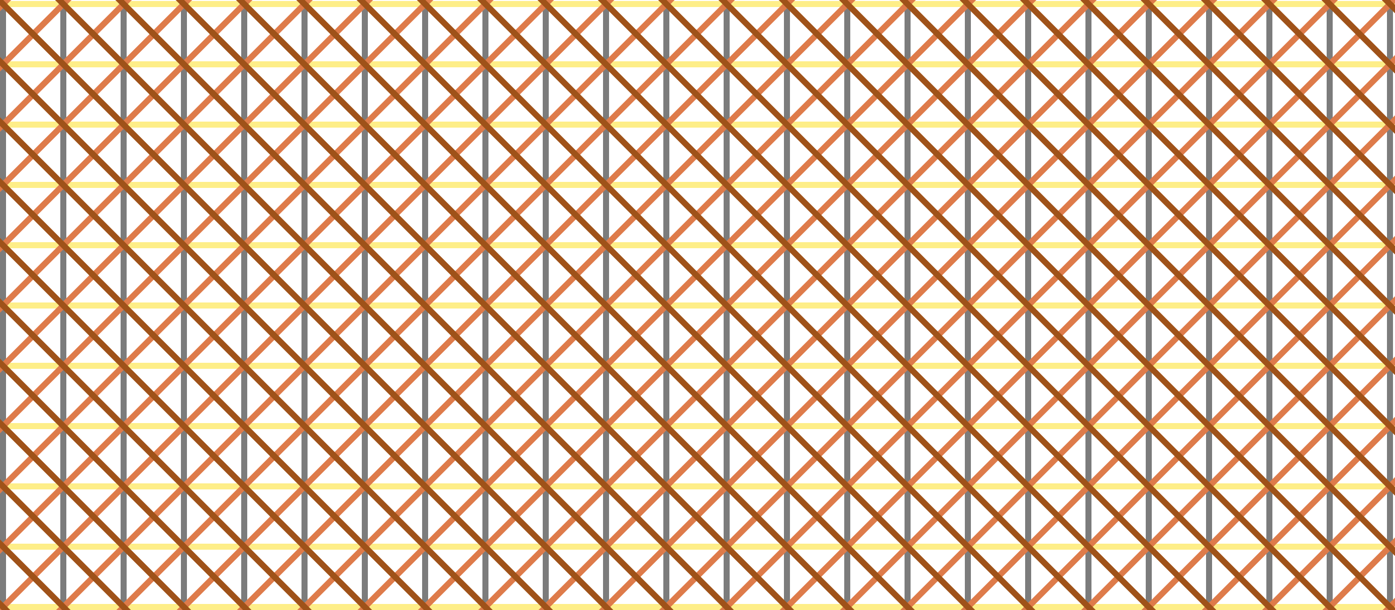
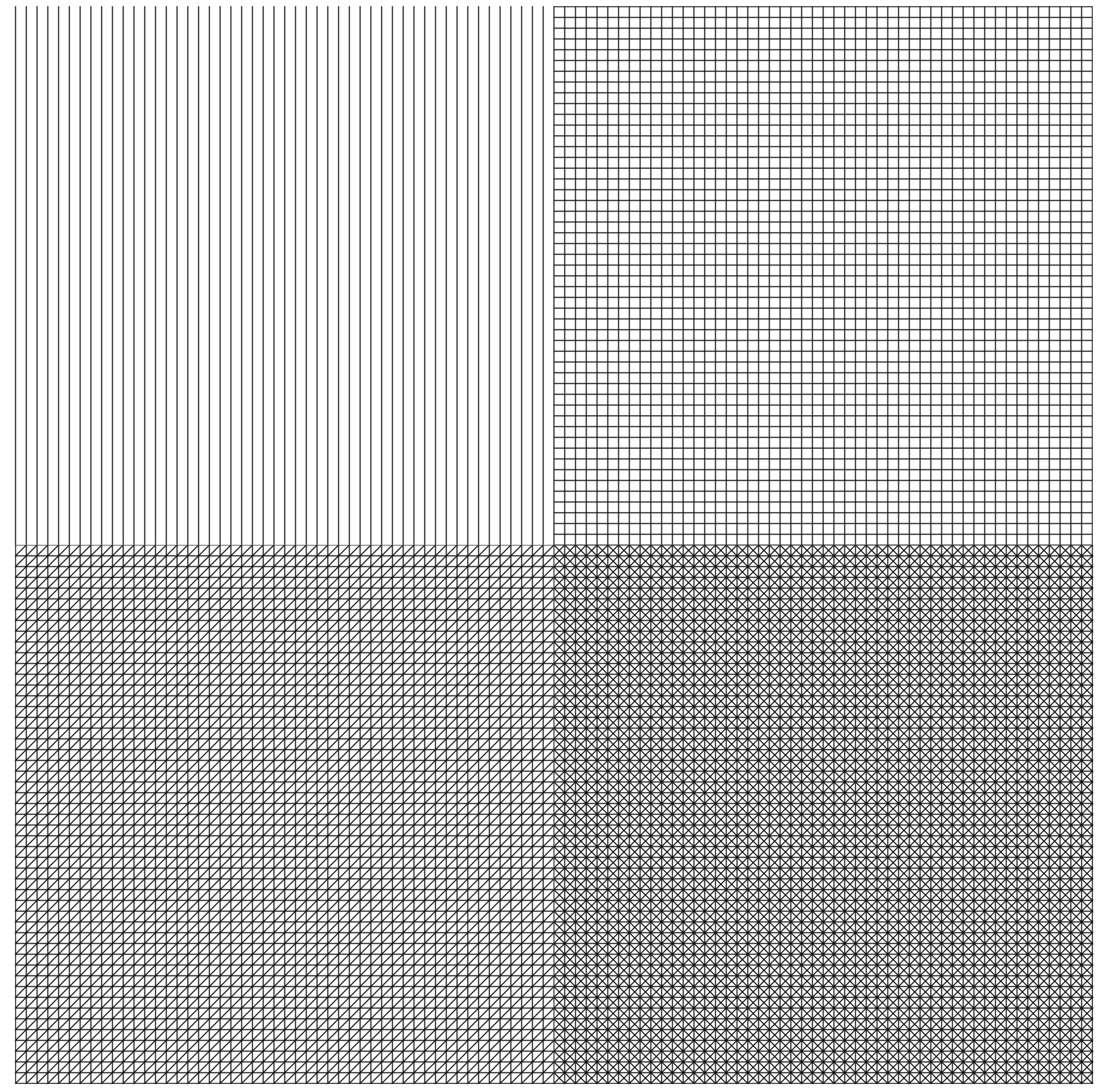
Wall Drawing 87: A square divided horizontally and vertically into four equal parts, each with lines and colors in four directions superimposed progressively.
Since this is so close to 56 (which I’ve already done), I wanted to add an additional element to challenge myself and learn something: Transitions. The difference between the two is the separate color for each line direction, which ended up lending itself to transitions nicely.
Adding the color and transitions into this one made me change my mental model for how I’m building these implementations. I was able to complete the first three I picked (56, 11, and 391) with only four
The solution turned out to solve my mental block for both the colors and the transitions. I started to doodle this drawing in a journal and realized that I did each line direction one whole layer at a time, layering each one on top of the others. Yet, I had been trying to cram all four directions into a single layer here on the web. So, I modified my D3 code to join more
Then, I added a transition() and a delay() to each “layer” so that the viewer can also experience and take notice of the intentional layering of this piece.
There is definitely more I can do with transitions. This is just the beginning for me. I achieved what I wanted with this piece, so I’m going to move on to others and continue exploring and learning how to implement transitions.
Here is an image preview. Click on it to see the D3.js version:
Open my D3 implementation of Wall Drawing 87 in a new window →
It is also available as a block.
Unlike the earlier colored versions that used grey, yellow, red, and blue, this uses Sol Lewitt’s second color palette of choice: grey, yellow, tan, and reddish-brown.
svg element with two groups and 8 rect elements in each group.transition() and delay() functions applied to animate the layers.Detail shot of the version on display at MASSMoCA: 
Wide shot of the version on display at MASSMoCA (Poor lighting): 

On October 13 I ran a data-related workshop for the Praxis community.
I split the talk up into two parts:

Download my slides without my talking notes ↓
Download my slides with my talking notes ↓
Thanks to TK Coleman for asking me to do the worksop and for recording the video!
Here are a few ideas on how Praxis participants can incorporate data analysis and visualization into their PDPs (personal development plans):
Aren’t familiar with Sol LeWitt or his art? Read this.
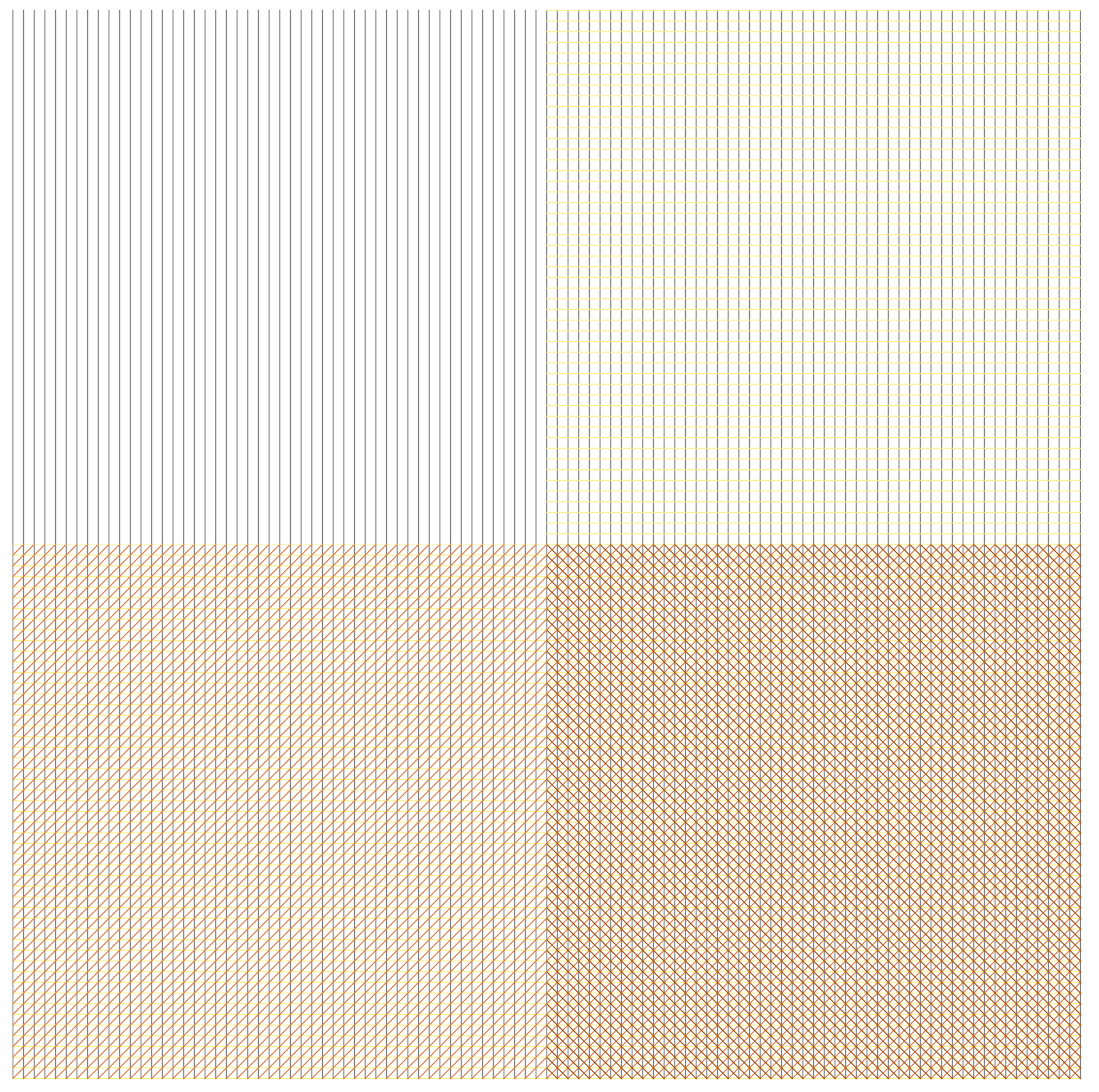
Wall Drawing 391: Two-part drawing. The two walls are each divided horizontally and vertically into four equal parts. First wall: 12-inch (30 cm) bands of lines in four directions, one direction in each part, drawn in black India ink. Second wall: Same, but with four colors drawn in India ink and color ink washes.
391 is one of the iconic images that people instantly recognize as a Sol LeWitt. After making the simple line drawings, I wanted to try something more comfortable and a little more complex. Now that I’ve created this, I could translate it into #419. Perhaps I will do this in the future.
Here is an image preview. Click on it to see the D3.js version:

Open my D3 implementation of Wall Drawing 391 in a new window →
rect elements in each group (one for each quadrant). The only difference between the left and right SVG squares is the color.sqrt(2) times the size of the vertical one. When I run those calculations and set the diagonal patterns as such, the right one lines up but the left one is shifted too far up. I ended up finding a middle ground, but the stroke size of the bottom ones aren’t exactly 36 pixels wide. They are 37 pixels wide. That is the price I pay for using a library. I’ll learn to write my own SVG patterns in the future.Wide shot of the version on display at MASSMoCA: 
Aren’t familiar with Sol LeWitt or his art? Read this.
Wall Drawing 11: A wall divided horizontally and vertically into four equal parts. Within each part, three of the four kinds of lines are superimposed.
Wall Drawing 11 is remarkably close to Wall Drawing 56, which is the first one I implemented. I discovered that with only a few changes (width, height, and pattern direction) I could turn my code for 56 into 11.

Open my D3 implementation of Wall Drawing 11 in a new window →
D3.js – The D3.js library is well-suited to Sol LeWitt’s early works. D3’s foundational principle of joining data to elements is easy to apply to LeWitt’s symmetrical objects.
Textures.js – I’m using this library to quickly create the background patterns. It plays very well with D3.js, which is why I chose it. It is a great little library that is very easy to use. It has some limitations around the edges, but the alternative is writing my own SVG paths for the patterns, which I didn’t want to do at this time.
Detail shot of the version on display at MASSMoCA: 
Wide shot of the version on display at MASSMoCA: 

Aren’t familiar with Sol LeWitt or his art? Read this.
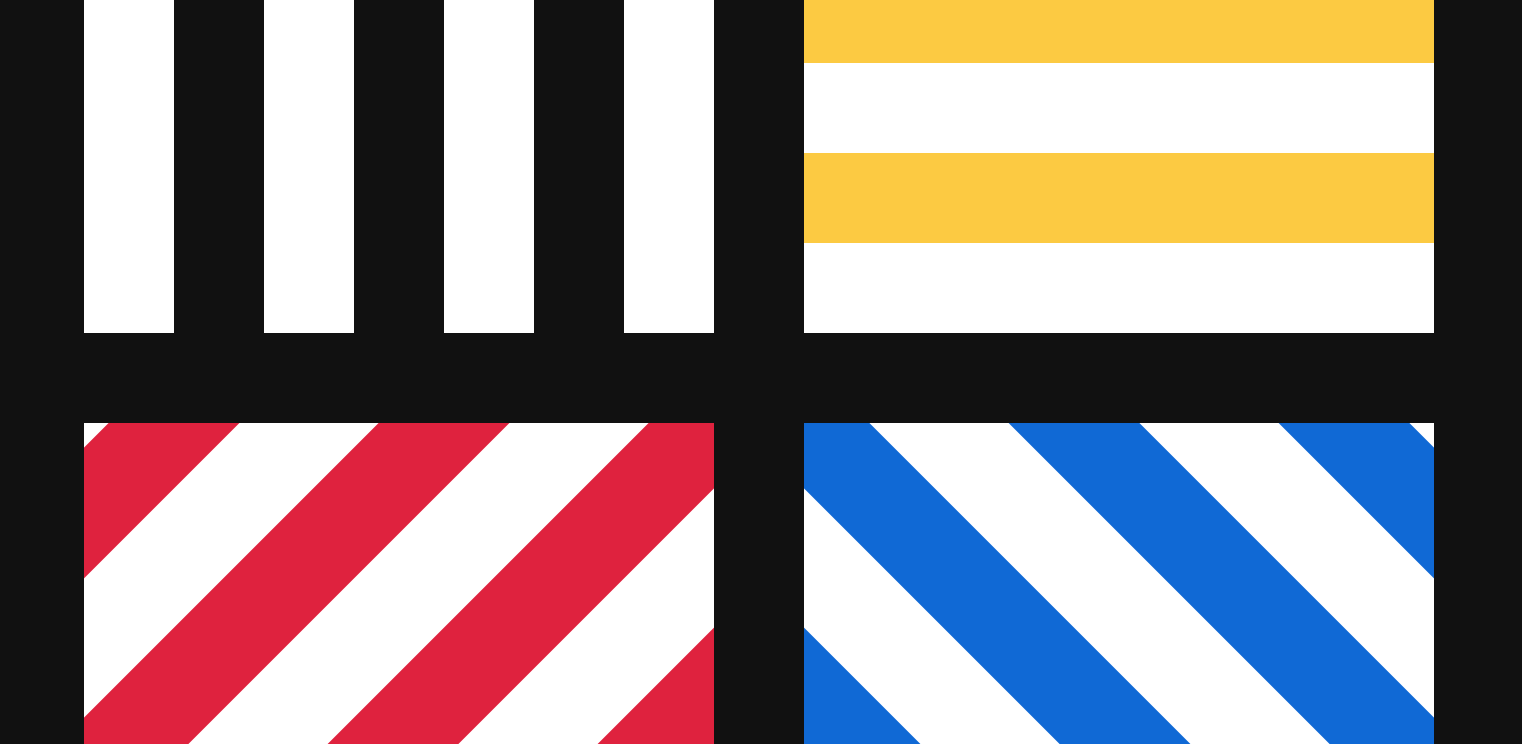
Wall Drawing 56: A square is divided horizontally and vertically into four equal parts, each with lines in four directions superimposed progressively.
Wall Drawing 56 was the first of Sol LeWitt’s wall drawings I tried to implement here on the web. I picked it for its simplicity: A square with four sets of patterns and two colors. I wasn’t sure exactly what interpreting and implementing these would entail, so I wanted something simple and recognizable at first.
Open my D3 implementation of Wall Drawing 56 in a new window →
D3.js – The D3.js library is well-suited to Sol LeWitt’s early works. D3’s foundational principle of joining data to elements is easy to apply to LeWitt’s symmetrical objects.
Textures.js – I’m using this library to quickly create the background patterns. It plays very well with D3.js, which is why I chose it. It is a great little library that is very easy to use. It has some limitations around the edges, but the alternative is writing my own SVG paths for the patterns, which I didn’t want to do at this time.
rect elements in each group (one for each quadrant).Detail shot of the version on display at MASSMoCA: 
Wide shot of the version on display at MASSMoCA: 

This is the most recent addition to my Jekyll Tools repository on GitHub. Isotope is a popular jQuery filtering and sorting plugin. I combined it with Liquid to generate category filtering in Jekyll.
You can see it in action at http://cagrimmett.com/category-isotope/.
You can find the code for this in my Jekyll Tools repo on GitHub.
This works by using YAML front matter to set categories and then outputting those categories as buttons and class names to work with the Isotope plugin.
Generate the buttons from categories:
class="button-group filter-button-group"> {% for category in site.categories %} class="button" data-filter=".{{ category | first }}">{{ category | first }} {% endfor %} class="button active" data-filter="*">All Generate your posts:
class="grid"> {% for post in site.posts %} class="element-item {{ post.category }}"> class="post-meta">{{ post.date | date: "%b %-d, %Y" }} class="post-link" href="{{ post.url | prepend: site.baseurl }}">{{ post.title }} {{ post.excerpt }} “All” is selected by default. The other buttons come from the category you specify at the top of a post in your YAML front matter.
Include the jQuery and Isotope libraries, then set up the functions to trigger the filtering and setting an “active” class on your buttons so you can highlight the active one:
// init Isotope var $grid = $('.grid').isotope({ // options }); // filter items on button click $('.filter-button-group').on( 'click', 'a', function() { var filterValue = $(this).attr('data-filter'); $grid.isotope({ filter: filterValue }); }); $('.button-group a.button').on('click', function(){ $('.button-group a.button').removeClass('active'); $(this).addClass('active'); }); 
Amanda and I spent a few days in California wine country at the end of March before we drove over to Yosemite. We were kind of disappointed in wine country because we expected to learn a lot more than any of the tour guides seemed to be interested in teaching us, so we took one of the days and drove over to the Point Reyes National Seashore.
That was a much better choice than visiting more wineries. The weather was wonderful and the scenery was incredible. We spend the morning horseback riding through parts of Point Reyes with the Five Brooks Ranch, then hopped in the car and drove out to the lighthouse point.


We got to see elephant seals for the first time, which was pretty awesome. They were so much louder than I was expecting. We could hear them from 1/4 mile away. It was windy and the temperature was dropping around golden hour, but we didn’t care. We stood and watched the seals for at least 30 minutes.


Point Reyes has a number of leased ranches and pastures inside its borders. What a great place to be a cow!


I upgraded to Jekyll 3.2.1 recently and got a strange error message when I ran jekyll build:
jekyll 3.2.1 | Error: undefined method 'downcase' for #After some searching, I came across an open issue related to this on Github.
The issue seems to be caused by a change in 3.2 that now reserves the config key theme to specify a gem-based theme for Jekyll. This means that you can’t use the key theme in your config.yml file to specify config settings for your jekyll theme. This was a standard practice for a lot of older Jekyll themes, so I expect this to be a somewhat common problem.
For example, in my config.yml file, I had the following:
# THEME-SPECIFIC CONFIGURATION theme: # Meta title: Chuck Grimmett avatar: avatar.png gravatar: # Email MD5 hash description: "Chuck Grimmett's blog" # used by search enginesThe fix is to change the theme key to something else. I chose template. You not only have to change this in your config.yml file, but you also have to change anywhere that accesses it in your template files. The string you are looking for here is site.theme.* and is usually in your includes and layout files (look for folders called _includes and _layouts).
I changed that section of my config.yml to this:
# THEME-SPECIFIC CONFIGURATION template: # Meta title: Chuck Grimmett avatar: avatar.png gravatar: # Email MD5 hash description: "Chuck Grimmett's blog" # used by search enginesThen I did a global search for site.theme. and replaced it with site.template.

Here is a problem I was faced with at work last week: Individuals who had two different kinds of relationships with an organization had two different contact records stored in two different files in a legacy database. The client wants to collapse those contact records down into one if possible, so we had to do a comparison between then.
Difficulties:
First things first: I got the information in a CSV file for comparison. I pulled this into Excel. Thankfully there was a unique ID between the two files that matched, so I was able to quickly deduplicate the first file and get the number of entries to match. Then I sorted the two files in the same order.
Here are the formulas I used for comparisons:
Compare cells on two different sheets and put out Yes if they match, No if they do not: =IF(E2='Sheet 2'!C2,"YES","NO")
Compare the first 5 characters of two cells instead of the whole contents. This is how I solved the whether or not addresses “matched” even if they have slight issues (APT vs #, ST vs St., S vs South). This won’t work for every situation, but I spot checked the cells and didn’t find any issues in my data set. =IF(LEFT(E2,5)=LEFT(F2,5),"YES","NO")
Counting the number of NOs in a particular column: =COUNTIF(G2:G150,"NO")
Count the number of YESes or NOs in a particular row. This will give you a good indicator of whether or not a row matches overall: =COUNTIF(H2:AC2,"NO") =COUNTIF(H2:AD2,"YES")

Hey, so this post is broken. I moved platforms and some of my old tutorials don’t play nicely with WordPress. I’m working on fixing them, but in the meantime you can view the old version here: https://cagrimmett-jekyll.s3.amazonaws.com/til/2016/08/27/d3-transitions.html
A few days ago we made a pie chart that updates in real time, but it has one issue: The update is jumpy. Let’s fix that.
I’ll admit, unlike the other tutorials where I was able to figure out most of this on my own, I had to mine other examples to figure this out. I primarily followed Mike Bostock’s Pie Chart Update, II, but his commented Arc Tween example was extremely helpful in understanding what d3.interpolate is doing.
Note: We’re starting with code from my previous Pie Chart Update tutorial.
First we need to store the beginning angle for each arc. You’ll recall that I’m using two separate arcs, one for the main chart and one for the labels. For about 10 minutes I was trying to figure out why the first update was jumpy but all subsequent ones were smooth. It turns out that we need to store the initial angles for each set of arcs:
g.append("path") .attr("d", arc) .style("fill", function(d) { return color(d.data.letter);}) .each(function(d) { this._current = d; }); // store the initial angles; g.append("text") .attr("transform", function(d) { return "translate(" + labelArc.centroid(d) + ")"; }) .text(function(d) { return d.data.letter;}) .style("fill", "#fff") .each(function(d) { this._current = d; }); // store the initial angles;Next we need to write two arcTween functions to transition between the two. I followed Mike Bostock’s example for the first one, then adapted it to the label arc, too:
function arcTween(a) { var i = d3.interpolate(this._current, a); this._current = i(0); return function(t) { return arc(i(t)); }; } function labelarcTween(a) { var i = d3.interpolate(this._current, a); this._current = i(0); return function(t) { return "translate(" + labelArc.centroid(i(t)) + ")"; }; }Last we need to include these arcTween() functions into the change() function we wrote before. I commented out the previous updates so you can compare them. The duration is 1/2 a second:
function change() { var pie = d3.pie() .value(function(d) { return d.presses; })(data); path = d3.select("#pie").selectAll("path").data(pie); //path.attr("d", arc); path.transition().duration(500).attrTween("d", arcTween); // Smooth transition with arcTween //d3.selectAll("text").data(pie).attr("transform", function(d) { return "translate(" + labelArc.centroid(d) + ")"; }); d3.selectAll("text").data(pie).transition().duration(500).attrTween("transform", labelarcTween); // Smooth transition with labelarcTween }Here is is in action. As always, you can view source to see the fully integrated example:

Last week we made a pie chart with D3.js. Today we are going to update it in realtime when buttons are clicked.
Here is the basic pie chart again, slightly modified from the original (I only changed the letters):
The key to making this work is D3’s object constancy. We already baked that into the original design by specifying a key function for the underlying presses count data.
First, we need to copy the pie chart we made last week. Make a few updates: change all the presses in data to 1 and change the letters to A, B, and C.
Next, we need something to click so we can increment the count and update the chart. Three buttons will do nicely:
class="buttons" style="width: 300px; text-align: center;"> id="a" style="width:50px;">A id="b" style="width:50px;">B id="c" style="width:50px;">C We ultimately want to call a specific update function when we click each button, so let’s write one. We need to consider what the most critical parts of making the original pie chart were so that we can recreate only the necessary steps:
d3.pieRemember that we have two arcs: The main pie and the one holding the labels. We need to update both!
function change() { var pie = d3.pie() .value(function(d) { return d.presses; })(data); path = d3.select("#pie").selectAll("path").data(pie); // Compute the new angles path.attr("d", arc); // redrawing the path d3.selectAll("text").data(pie).attr("transform", function(d) { return "translate(" + labelArc.centroid(d) + ")"; }); // recomputing the centroid and translating the text accordingly. }Now we need to update the underlying data and the whole chart on click:
d3.select("button#a") .on("click", function() { data[0].presses++; change(); }) d3.select("button#b") .on("click", function() { data[1].presses++; change(); }) d3.select("button#c") .on("click", function() { data[2].presses++; change(); })Here is the result. Click the buttons and watch the chart change!
Up next: Smooth transitions with d3.interpolate.

Amanda and I spent a few days in Yosemite at the end of March. We love going to national parks in the spring. The weather is cool, the parks aren’t crowded, and the waterfalls are spectacular due to snowmelt. The tradeoff you make is that some parts of the park are still inaccessible due to snow. You win some, you lose some. I don’t think we lost much in this particular situation.
As we drove into the park around sunset hoping there was not actually a tire chain checkpoint, we were treated to some beautiful views of trees, fog, and the aftermath of forest fires.


One of the most incredible things about Yosemite is the clouds. Weather changes there pretty quickly, so don’t be disappointed if the traditional panorama is obscured. Wait 15 minutes and you’ll probably catch a glimpse.


We decided to hike the Mist Trail our first full day in the park. The trail up the edge of Vernal falls was 100% ice in the morning. It took us quite some time to make it up, but I’m glad we carefully trudged up instead of turning around.


We followed the Mist Trail all the way to the top of Nevada Falls. There were some pretty cool trees growing in the cracks of the rocks up there. The connection to the Muir Trail from Nevada Falls was closed due to snow, so we had to hike back down and take a different route back up. Doing that elevation twice was a killer on our legs. We must have made a few unexpected turns, too, because the total listed length of the trails on our map was 7 miles, but our fitness trackers reported 12 miles.


We gave our sore legs a rest the next day. We drove as much of the park as we could and only did short hikes to see some of the giant sequoias. Words can’t describe what it is like to walk amongst them.
Can you believe the largest trees on earth come from tiny seeds in such small cones?


One had fallen over ages ago and its root system was exposed:

Here are the views that probably come to mind when you think of Yosemite:


Hey, so this post is broken. I moved platforms and some of my old tutorials don’t play nicely with WordPress. I’m working on fixing them, but in the meantime you can view the old version here: https://cagrimmett-jekyll.s3.amazonaws.com/til/2016/08/19/d3-pie-chart.html
This is part of my ongoing effort to relearn D3.js. This short tutorial applies what I’ve learned about data joins, arcs, and labels. It varies slightly from other examples like Mike Bostock’s Pie Chart block because I’m using D3.js version 4 and the API for arcs and pies is different from version 3, which most tutorials are based on. I figured this out through some trial and error. Always read the documentation!
I’m eventually going to use this pie chart as a base to learn how to update charts in real time based on interactions like button pushes or clicks.
Since I’m eventually going to figure out how to update this chart in real time based on button presses, I’m going to start with some dummy data for three easy-to-press buttons: q, w, and e. As always, I log it to the console for quick debugging:
var data = [{"letter":"q","presses":1},{"letter":"w","presses":5},{"letter":"e","presses":2}]; console.log(data);We’ll also need some basics like width, height, and radius since we are dealing with a circle here. Make them variables so your code is reusable later:
var width = 300, height = 300, // Think back to 5th grade. Radius is 1/2 of the diameter. What is the limiting factor on the diameter? Width or height, whichever is smaller radius = Math.min(width, height) / 2;Next we need a color scheme. Be referring to the API, we learn that we should use .scaleOrdinal() for this:
var color = d3.scaleOrdinal() .range(["#2C93E8","#838690","#F56C4E"]);We need to set up the pie based on our data. According to the documentation, d3.pie() computes the necessary angles based on data to generate a pie or doughnut chart, but does not make shapes directly. We need to use an arc generator for that.
var pie = d3.pie() .value(function(d) { return d.presses; })(data);Before we create the SVG and join data with shapes, let’s define some arguments for the two arcs we want: The main arc (for the chart) and the arc to hold the labels. We need an inner and outer radius for each. If you change the inner radius to any number greater than 0 on the main arc you’ll get a doughnut.
var arc = d3.arc() .outerRadius(radius - 10) .innerRadius(0); var labelArc = d3.arc() .outerRadius(radius - 40) .innerRadius(radius - 40);We always start with an SVG. Select the div we created to hold the chart, append an SVG, give the SVG the attributes defined above, and create a group to hold the arcs. Don’t forget to move the center points, or else the chart will be centered in the upper right corner:
var svg = d3.select("#pie") .append("svg") .attr("width", width) .attr("height", height) .append("g") .attr("transform", "translate(" + width/2 + "," + height/2 +")"); // Moving the center point. 1/2 the width and 1/2 the heightNow let’s join the data generated by .pie() with the arcs to generate the necessary groups to hold the upcoming paths. Give them the class “arc”.
var g = svg.selectAll("arc") .data(pie) .enter().append("g") .attr("class", "arc");Now we can append the paths created by the .arc() functions with the variables we defined above. We’re using the color variable we defined above to get the colors we want for the various arcs:
g.append("path") .attr("d", arc) .style("fill", function(d) { return color(d.data.letter);});Once you save, you should see a chart. Now we’re cooking with data!
Let’s put some labels on it now. We’ll need to append some text tags in each arc, set the position with a transform defined by the labelArc variable we defined earlier, then access the correct letter to add to the label. Then we’ll make it white so it shows up a little better:
g.append("text") .attr("transform", function(d) { return "translate(" + labelArc.centroid(d) + ")"; }) .text(function(d) { return d.data.letter;}) .style("fill", "#fff");There you have it! A basic pie chart. Play around with the variables so you understand better what is going on.

Hey, so this post is broken. I moved platforms and some of my old tutorials don’t play nicely with WordPress. I’m working on fixing them, but in the meantime you can view the old version here: https://cagrimmett-jekyll.s3.amazonaws.com/til/2016/08/17/d3-lets-make-a-grid.html
I’ve been on a mission to relearn the fundamentals of D3.js from the ground up. This tutorial is a way to apply what I learned about data joins, click events, and selections. Along the way I learned about building arrays.
I also wrote this up as a block for those interested.
We want to make a 10×10 grid using D3.js. D3’s strength is transforming DOM elements using data. This means we’ll need some data and we’ll want to use SVG and rect elements.
We could write an array of data for the grid by hand, but we wouldn’t learn anything then, would we? Let’s generate one with Javascript.
Picture a grid in your head. It is made up of rows and columns of squares. Since this is ultimately going to be represented by an SVG, let’s think about how an SVG is structured:
What you see here is a basic structure of rows and columns. That means that when we make our data array, we want to make a nested array of rows and cells/columns inside those rows. We’ll need to use iteration to do this. Easy-peasy.
The other question we’ll have when making these arrays is, “What attributes will this grid need?”. Think about how you’d draw a grid: You start in the upper right corner of a piece of paper, draw a 1×1 square, move over the width of 1 square and draw another, and repeat until you get to the end of the row. Then you’d go back to the first square, draw one underneath it, and repeat the process. Here we’ve described positions, widths, and heights. In SVG world these are x, y, width, and height.
Here is the function I’m using to create the underlying data for the upcoming grid. It makes an array that holds 10 other arrays, which each hold 10 values:
function gridData() { var data = new Array(); var xpos = 1; //starting xpos and ypos at 1 so the stroke will show when we make the grid below var ypos = 1; var width = 50; var height = 50; // iterate for rows for (var row = 0; row < 10; row++) { data.push( new Array() ); // iterate for cells/columns inside rows for (var column = 0; column < 10; column++) { data[row].push({ x: xpos, y: ypos, width: width, height: height }) // increment the x position. I.e. move it over by 50 (width variable) xpos += width; } // reset the x position after a row is complete xpos = 1; // increment the y position for the next row. Move it down 50 (height variable) ypos += height; } return data; }We made a cool array above and now we’ll make the data correspond to svg:rect objects to make our grid. First we’ll need to make a div to append everything to (and, of course, don’t forget to include the latest version of D3 in your header):
id="grid"> Now we need to assign our data to a variable so we can access it:
var gridData = gridData(); // I like to log the data to the console for quick debugging console.log(gridData);Next, let’s append an SVG to the div we made and set its width and height attributes:
var grid = d3.select("#grid") .append("svg") .attr("width","510px") .attr("height","510px");Next, we can apply what we learned in Mike Bostock’s Thinking With Joins to make our rows:
var row = grid.selectAll(".row") .data(gridData) .enter().append("g") .attr("class", "row");And finally we make the individual cells/columns. Translating the data is a bit trickier, but the key is understanding that we are doing a selectAll on the rows, which means that any reference to data is to the contents of the single array that is bound to that row. We’ll then use a key function to access the attributes we defined (x, y, width, height):
var column = row.selectAll(".square") .data(function(d) { return d; }) .enter().append("rect") .attr("class","square") .attr("x", function(d) { return d.x; }) .attr("y", function(d) { return d.y; }) .attr("width", function(d) { return d.width; }) .attr("height", function(d) { return d.height; }) .style("fill", "#fff") .style("stroke", "#222");You’ll note that I added style fill and stroke attributes to make the grid visible.
When we put it all together, here is what we get:
Note: If you are viewing this on your phone, you might want to switch over to a tablet or desktop. I haven’t optimized this example for mobile because that will needlessly complicate it.
Cool, huh? Go ahead and inspect the element and marvel at your find handiwork. Then change the fill, stroke, width, and height attributes and see how it changes.
Let’s have some fun and add click events to the individual cells. I want to have cells turn blue on the first click, orange on the second, grey on the third, and white again on the fourth. Since D3 is data-driven, we’ll need to add some click data to the arrays and then add functions to change it and set colors based on the number of clicks.
//add this to the gridData function var click: 0; //add this to the cell/column iteration data.push click: click //add this to var column = row.selectAll(".square") .on('click', function(d) { d.click ++; if ((d.click)%4 == 0 ) { d3.select(this).style("fill","#fff"); } if ((d.click)%4 == 1 ) { d3.select(this).style("fill","#2C93E8"); } if ((d.click)%4 == 2 ) { d3.select(this).style("fill","#F56C4E"); } if ((d.click)%4 == 3 ) { d3.select(this).style("fill","#838690"); } })Let’s break down that on('click') function:
Here it is. Click away!
What happens when we randomize click counts when we create the data array?
//add this to the gridData function var click: 0; //add this to the cell/column for loop, just above the data.push line click = Math.round(Math.random() * 100); //add this to var column = row.selectAll(".square") .style("fill", function(d) { if ((d.click)%4 == 0 ) { return "#fff"; } if ((d.click)%4 == 1 ) { return "#2C93E8"; } if ((d.click)%4 == 2 ) { return "#F56C4E"; } if ((d.click)%4 == 3 ) { return "#838690"; } })Note that Math.random() returns a number between 0 and 1, inclusive. Multiple that by 100 if you want a number between 1 and 100.
It changes when you refresh!
What happens when we change the click event to a mouseover event and make a bigger grid? It becomes a lot more fun. I’ll leave the implementation as an exercise to the reader. If you’ve been following along and writing this yourself instead of copying and pasting, you probably already know which variables and events to change:

These are my outputs from Mike Bostock’s Three Little Circles Tutorial, slightly modified so I could understand how each of these items work. This is a tutorial about selections and basic data joins.
We start with three basic SVG circles:
height="50px" width="250px"> cx="40" cy="20" r="10"> cx="80" cy="20" r="10"> cx="120" cy="20" r="10">
Now let’s select them and make them a little bigger and orange!
var circle = d3.selectAll("svg#orange circle") .style("fill", "darkorange") .attr("r", 20);
Now how about making them light blue and having a randomly-generated height that resets every second?
function jump(){ var circle = d3.selectAll("svg#random-height circle") .style("fill", "lightblue") .attr("cy", function() { return Math.random() * 150 + 10;}); } jump(); setInterval(jump, 1000);
That’s cool!
Now let’s do some data joins. How about making the radius of the circle a function of a data set?
var circle = d3.selectAll("svg#data-radius circle") .data([2, 3, 4]) .attr("r", function(d){ return d*d; });
Looks like the radius is a square of the data. Go ahead and inspect the element to confirm!
You’ll notice that the function uses the name d to refer to bound data.
Let’t make these purple for variety and write a linear function to space them out horizontally.
var circle = d3.selectAll("svg#data-cx circle") .style("fill","purple") .data([2, 3, 4]) .attr("cx", function(d,i){ return i*100 + 70});
This uses a new function: The index of the element within its selection. The index is often useful for positioning elements sequentially. We call it i by convention.

I’m relearning D3.js. Here are notes from different resources I’m reading.
Notes from the D3js.org Introduction.
Here is Mike Bostock’s examples for how to change the text color of paragraph elements with the W3C method vs D3 method:
W3C:
var paragraphs = document.getElementsByTagName("p"); for (var i = 0; i < paragraphs.length; i++) { var paragraph = paragraphs.item(i); paragraph.style.setProperty("color", "white", null); }D3:
d3.selectAll("p").style("color", "white");To alternate shades of gray for even and odd nodes:
d3.selectAll("p").style("color", function(d, i) { return i % 2 ? "#fff" : "#eee"; });d3.selectAll("p") .data([4, 8, 15, 16, 23, 42]) .style("font-size", function(d) { return d + "px"; });data operator. D3 will retrieve the previously-bound data. This allows you to recompute properties without rebinding..enter() selection. Example:d3.select("body") .selectAll("p") .data([4, 8, 15, 16, 23, 42]) .enter().append("p") .text(function(d) { return "I’m number " + d + "!"; });data operator. If you forget the enter and exit selections, you will automatically select only the elements for which there exists corresponding data.// Update… var p = d3.select("body") .selectAll("p") .data([4, 8, 15, 16, 23, 42]) .text(function(d) { return d; }); // Enter… p.enter().append("p") .text(function(d) { return d; }); // Exit… p.exit().remove();To fade the background of the page to black:
d3.select("body").transition() .style("background-color", "black");Or, to resize circles in a symbol map with a staggered delay:
d3.selectAll("circle").transition() .duration(750) .delay(function(d, i) { return i * 10; }) .attr("r", function(d) { return Math.sqrt(d * scale); });.append() method can create single elements, but if you want multiple, you need to think in a different way.svg.selectAll("circle") .data(data) .enter().append("circle") .attr("cx", function(d) { return d.x; }) .attr("cy", function(d) { return d.y; }) .attr("r", 2.5);
Data points joined to the existing elements produce the update (inner) selection. Leftover unbound data produce the enter (left) selection, which represents missing elements. Any remaining unbound elements produce the exit (right) selection, which represents elements to be removed.
Now let’s explain the svg.selectAll("circle"):
selection.data and the enter and exit selections hang off the update selection. selection.enter returns the enter selection.selection.append on the enter selection. This appends a new circle for each data point in the SVG container.enter selection is sufficient. But you can support dynamic visualizations with minor modifications to update and exit.Emmet is a tool I just found that expands your HTML and CSS workflow. It expands HTML from CSS-based abbreviations and quickly selects important parts of the code you are editing.
For example, div>ul>li turns into:
Visit the Emmet site to learn more, download it, and read the docs.

I was listening to Data Stories Episode 22: NYT Graphics and D3 with Mike Bostock and Shan Carter today and I realized that while I’ve used D3.js for bar charts and mapping projections, I don’t really understand it. I never took the time to learn the fundamentals, so I’ve always been constrained to cobbling together things from other examples.
That needs to change.
Here is a list of resources I plan to go through. I should be able to relearn the basics fairly quickly so that I can spend time making charts of my own. I’ll update completed items with check marks as I go through them.