Today I fished the small headwaters of a stream I drive by daily that eventually empties into the Hudson River. When I say small, I mean small. The average depth of the section I fished on state land is probably 6in, with an average width of 5ft.
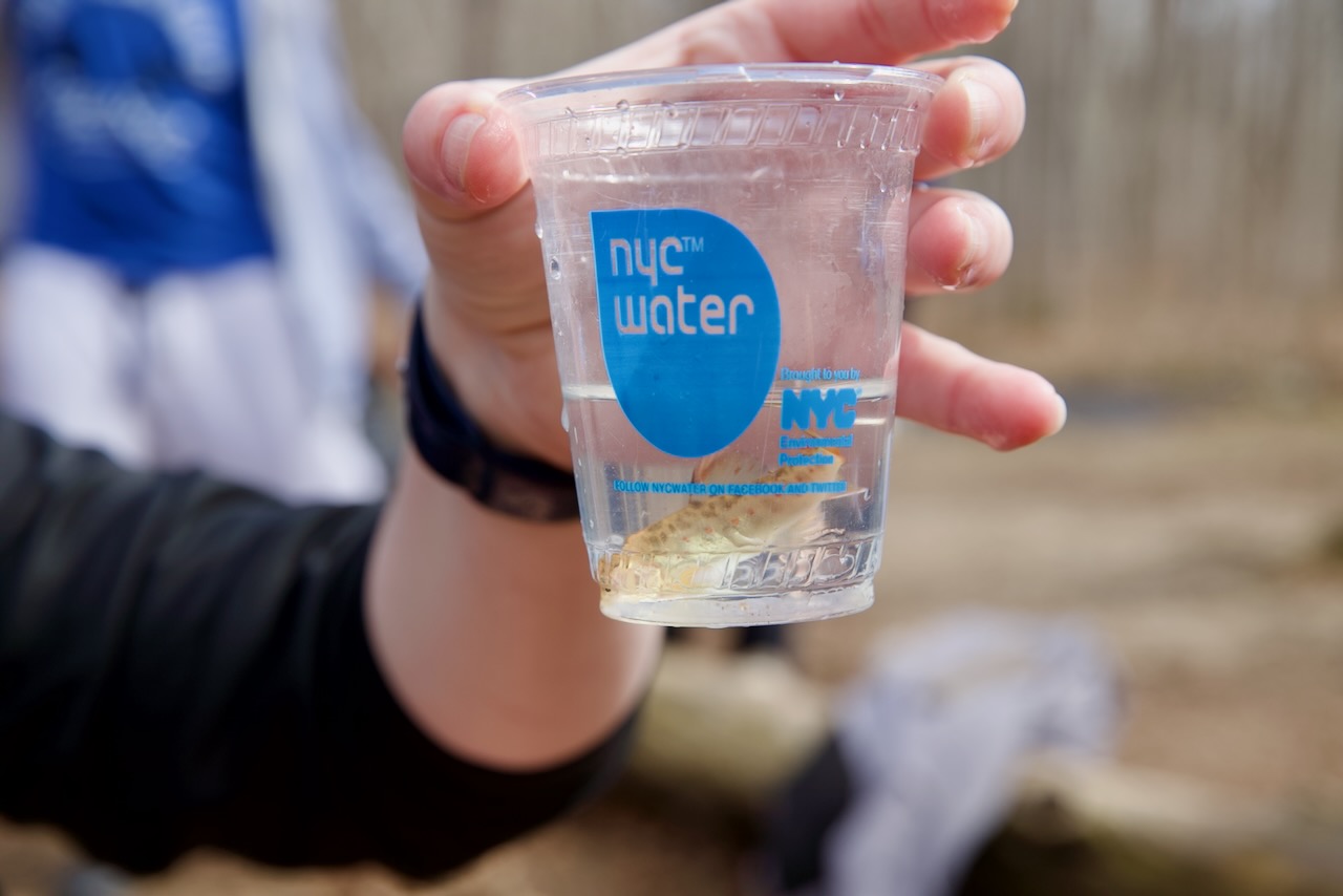
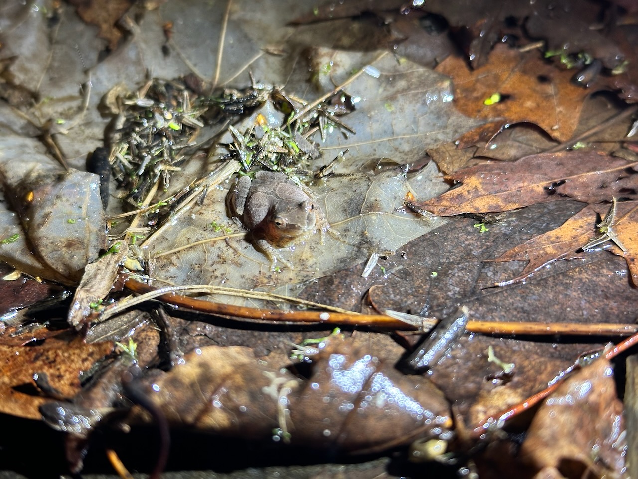
I saw lots of eastern blacknose dace in the stream, but something slightly different caught my eye too, so I stuck my phone down in the water to record a video to be sure:
Yes! Swimming around with the blacknose dace is a tiny trout parr. I took a temperature reading: 60F, even in shallow water. Great sign on this 85F day. I got out my fly rod and started working the pocket water.
I wasn’t getting any hits at all on my dry flies (I tried a size 16 Mr. Rapidan and a size 18 BWO Sparkle Dun), so I tied on a size 16 bead head hares ear nymph and started working the three pools on that section of the stream.
In the deepest of the three, probably 8 ft deep, a decent sized fish followed my fly right up to the edge and then caught a glimpse of me and swam away with a splash. That caught my attention. It was the only thing bigger than a dace I’d seen. I had to know what it was!

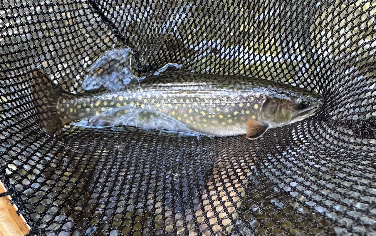
After about 5 minutes of slow casting, I got a strike, but whatever it was didn’t take the fly. I decided to put a tiny indicator on at around 5ft of depth and let the fly slowly float through the pool. The indicator disappeared on the fourth retrieve and I set the hook. The fish jumped out of the water and I knew I found what I came for. I had a trout on the line.
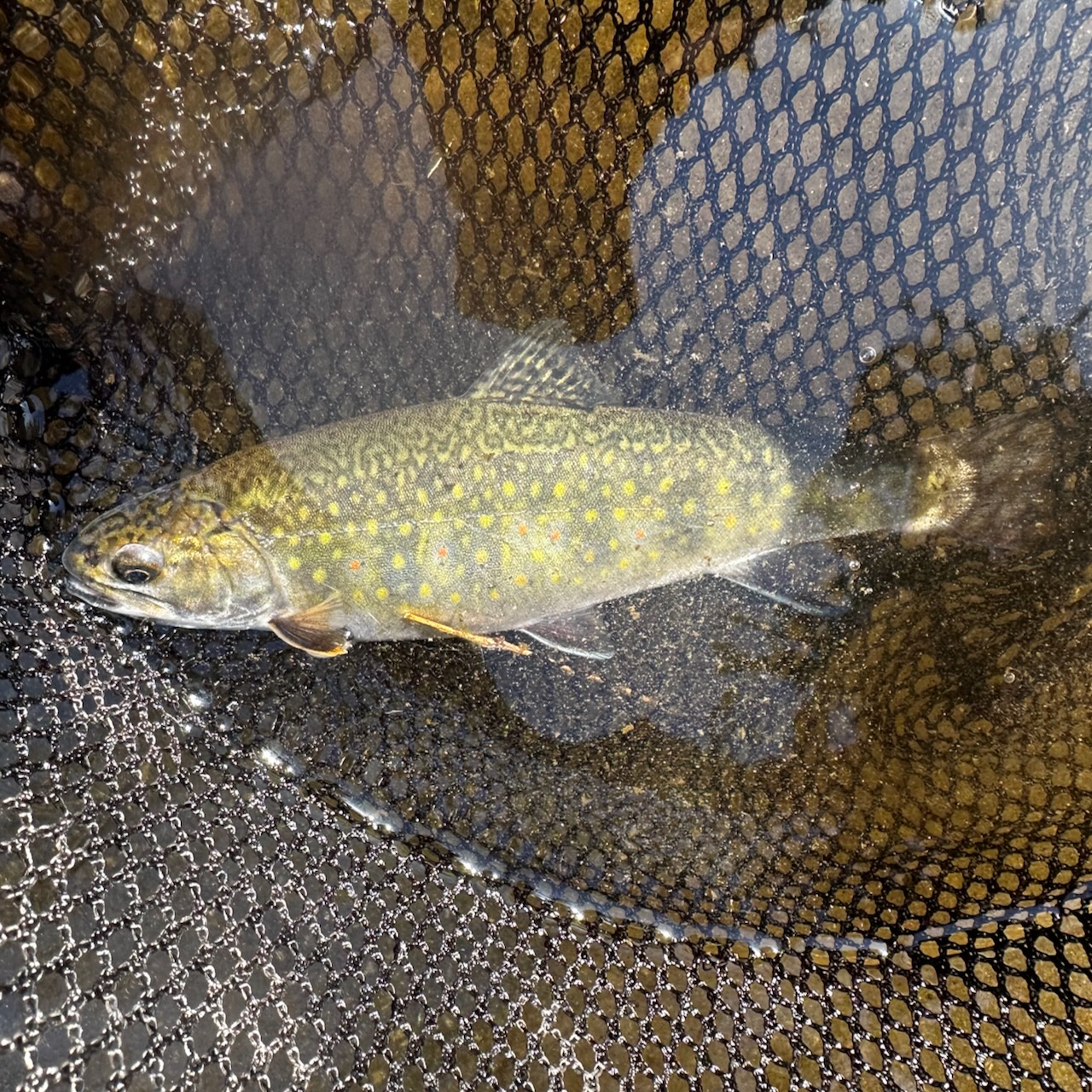
Not just any trout… I caught a brook trout!

What surprised me was the size. 9 inches! I expected something in the ~5in range since the stream is so small. A healthy 9in brook trout was a great thing to find.

I quickly let it go and we went our separate ways. It swam back down to the depths of the pool and I hiked back up the stream to the car.
What a delight to find another stream with native brook trout close to home.
Note to self for my next tying session: More size 16 and 18 bead head hares ear nymphs to sink to the bottom of holes like this.