
Tag: Data Viz
-
Our Inflated Thanksgiving, 2016 Edition
 Read more…: Our Inflated Thanksgiving, 2016 Edition
It’s not just the balloons at the Macy’s Thanksgiving Day Parade that are inflated. Each year the American Farm Bureau Federation collects an informal price survey for a typical Thanksgiving dinner. The shopping list has remained the same for the past 31 years: turkey, bread stuffing, sweet potatoes, rolls with butter, peas, cranberries, a veggie…
-
Praxis Data Workshop – Telling a Stronger Story with Data Visualization
 Read more…: Praxis Data Workshop – Telling a Stronger Story with Data Visualization
The video, slides, and notes from my Praxis workshop on data analysis and visualization.
-
Using Word Frequency Charts for Better Word Clouds
 Read more…: Using Word Frequency Charts for Better Word Clouds
You can use word count charts to complement word clouds for better understanding.
-
Photo Metadata Analysis Project
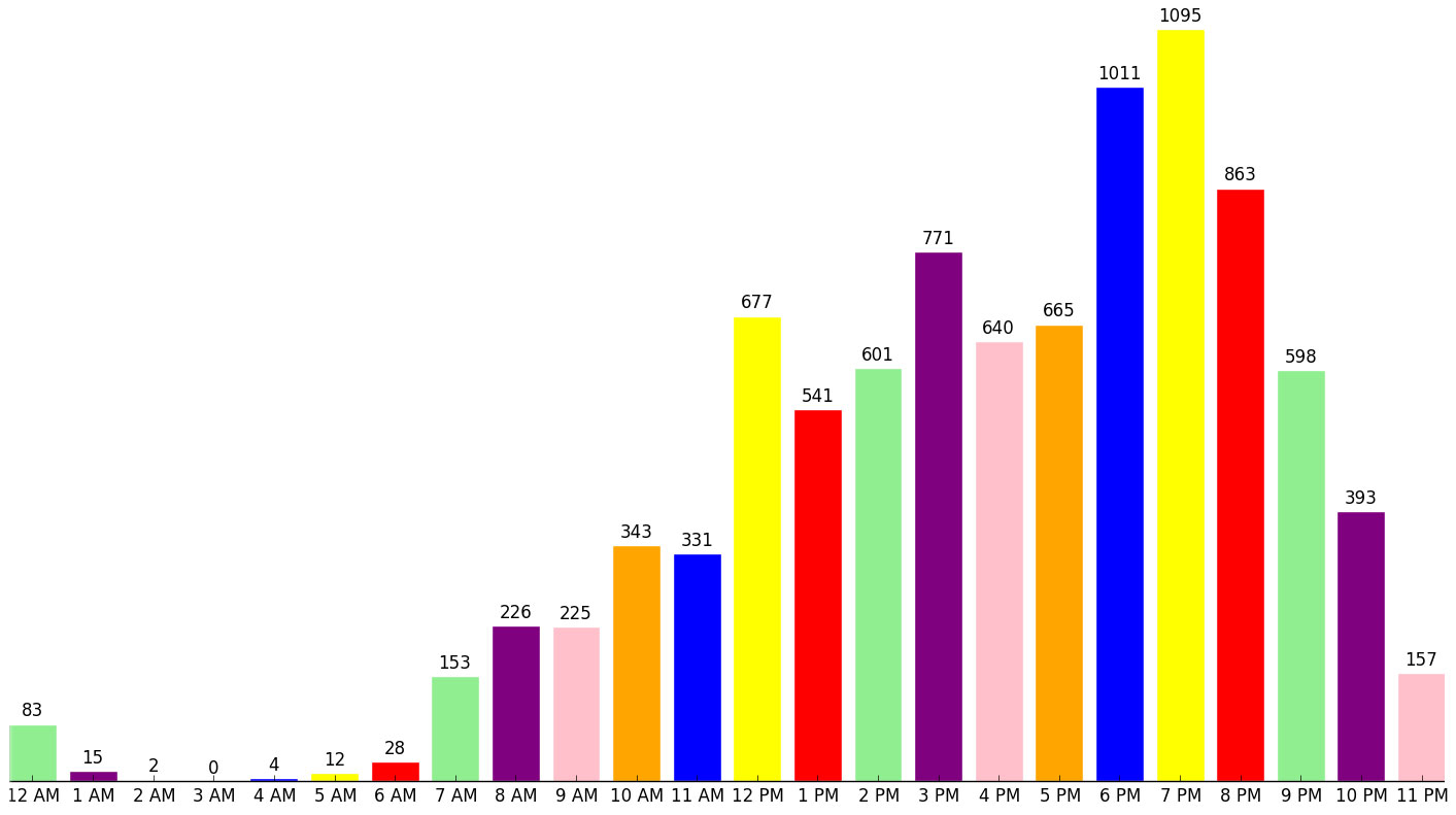 Read more…: Photo Metadata Analysis Project
A post-game write-up of what I learned from a recent personal data project, complete with instructions so you can try it!
-
Responsive D3.js bar chart with labels
 Read more…: Responsive D3.js bar chart with labels
TIL how to make
-
Steph Curry’s Advantage (Or How to Become a Leader in the NBA)
 Read more…: Steph Curry’s Advantage (Or How to Become a Leader in the NBA)
How do you become a leader in the NBA? Take more shots than everyone else.
-
Our Inflated Thanksgiving
Read more…: Our Inflated ThanksgivingFor the past 29 years, the American Farm Bureau Federation has conducted an informal survey of the price of a classic Thanksgiving dinner for 10 people. At first glance, it looks like the price of food has been steadily rising. But when you , you get a different story. It isn’t the cost of our…