The best projects are ones that build something you want to use or solve a problem you actually have. They don’t need to be big or new. Almost every project starts out as small and a remix of something else. Then you take it and build on it.
Blog
-
Scratch your own itch
-
Creating Consistently

“Piece of pie.” — Donatello Creating is awesome. Creating consistently is even better. Here are some strategies for being consistent in your creative endeavors.
I’ve spent the last month blogging every day, but this isn’t the first time I’ve regularly put stuff out online. I posted every single day in 2010 and I’ve averaged a post a week since 2011.
Here are some strategies I use to create content consistently. This applies to writing, painting, podcasting, and other creative endeavors.
Harness Inspiration
When you have an idea, stop and get it down. If you have move things around enough to write the full post, that is great. If not, spend 5 minutes making an outline that you can flesh out later.
Amanda and I have made this a regular part of our lives. It is not uncommon for us to pause our conversation in the middle of dinner to get down bullet points that we can return to later.
Don’t Wait for Perfection
Getting over your fear of shipping is necessary to producing content consistently.
I don’t have a lot of advice here other than:
- The more you do it, the easier it is.
- Not everything needs to be groundbreaking. People are encountering something new for the first time every single day. I bet you have many things you can introduce people to.
- Ignore other people. Constructive feedback is one thing, but if it isn’t coming from people who also consistently produce content, ignore it and move on. In the words of Phife Dawg in Scenario:
Bo knows this (what?) and Bo knows that (what?)
But Bo don’t know jack, cause Bo can’t rapI reread The War of Art or Turning Pro, both by Steven Pressfield, at least once a year to get back on track with shipping.
Remove Barriers
When you are tired and don’t want to produce, any barrier can be turned into an excuse to wait until the next day. Remove as many barriers as you can.
- If you write on Medium or WordPress, download the mobile apps and post directly from your phone.
- If you are a drawer or designer, carry your sketchbook around with you.
- If you paint, carry a mini watercolor set with you.
- If you podcast, record voice memos to while you walk or drive that can be spliced into usable segments.
- If you are a web developer, use Keyboard Maestro or Text Expander to automate launching your entire development environment.
Take every piece of your creative process and remove as much friction as possible. Creation shouldn’t be something that only happens when the stars align. The easier you make it to get to work, the more work you’ll get done.
Take Cues from Daily Life
Everything you do in your daily life presents you with a chance to create. Writing is the most obvious because you can write about situations, problems, and things you’ve learned. You can also apply this to other forms of creation:
- We were preparing for visitors a few days ago, so I wrote out my checklist for guest preparation.
- We took a day trip from LA to Joshua Tree National Park a few weeks ago, so a few days later I wrote an itinerary for others to follow.
- I went to the Hudson River Museum with some friends, so I took notes and wrote a post with interesting facts about the Hudson.
- Both Amanda and I write about problems we solve at work.
- I spend a part of every work day solving tech problems, so I generalize the specific issues and write tech tutorials that others can use.
- I take photos whenever I cook anything new, so if it turns out really well I have visuals that I can turn into a full post on Cook Like Chuck.
- I take photos of what I eat out and write down tasting notes so that I can use those flavors in my own cooking.
- If you are a visual artist, take lots of photos of things that inspire you throughout the day and make a point to revisit them each time you sit down to work.
- If you are a podcaster, take 5 minutes out of every hour to make voice memos about what you are thinking about.
- If you build houses, keep architecture notes and take photos of things that inspire you. Go through them before you start drafting your next project.
Keep Lists

Orange is drafted, green is published. Whenever I have an idea for a post but can’t write it immediately, I put it in my Blog ideas Trello board. I have a list for each blog I can post to. If I have an outline, I put it in the comments.
I bet visual artists, podcasters, journalists, and creators of all types could do the same thing with their craft.
Play the Long Game
Playing the long game can mean two things:
- Doing small things consistently build up into a large body of work over time. I started posting my reading notes back in November and have already built up 15 entries.
- Notes and photos taken today can be combined and used any time in the future. If you get in the habit of building things up over time, you will set future you up for success.
Here are some cases where I’ve played the long game on Cook Like Chuck:
- I took notes and photos of my kombucha experiments over the course of a year and turned it into a long post at the end of the year.
- I took photos of every weekend breakfast I made for a few months, then noticed a trend and wrote a recipe for Breakfast Bowls.
- I took progression photos of pear brandy aging for two months and it made a nice gallery.
- I collected my favorite cocktail recipes for a few years and turned them into an online cocktail library.
- I kept track of weekly CSA deliveries for an entire season and crunched the numbers at the end of the year to do a cost comparison.
I also love creating personal cheatsheets. Every time you have to look something up, explain it in your own words and add it to a note or document. You can publish these over time. Here are a few I’ve made:
- DNS Terms cheatsheet
- Linux cheatsheet
- Vegetable roasting times, temperatures, and spices that pair well
- It isn’t posted yet, but I have one in the works for Regular Expressions snippets that I use all time for reformatting text.
-
Creating Consistently

-
Five Things You Didn’t Know About the Hudson River

Photo of the Hudson from Breakneck Ridge by Greg Barry 
1. The Hudson is a Tidal Estuary
Twice a day the waters of the Atlantic rise higher than the levels of the Hudson. At high tide, salt water pushes up the Hudson, raising the water levels. When the tide goes back out, the Hudson switches back to its normal flow direction back out to sea.
The salinity levels vary by location and time of year. In the spring, the fresh water line is around Yonkers. At the end of summer, the river is salty all the way up to Newburgh.
2. The Hudson has lots of blue crab
Maryland isnât the only place that has blue crab. Commercial and recreational fisheries up and down the Hudson catch blue crab from June through October.
They migrate up the river in the summer to feed as the salt line moves further north, then they migrate back into saltier waters by the bay in the winter.
I regularly see blue crab around marshes at low tide in Yonkers in the summer.
3. Tappan Zee Bridge is at the riverâs second widest point in order to keep toll revenue going to New York State
The Tappan Zee Bridge, which goes from Rockland County to Westchester County near Tarrytown, is at the Hudsonâs second-widest point, even though the river gets much narrower closer to NYC.
The reason that the location neat Tarrytown was chosen was because it is just outside of Port Authorityâs 25 mile jurisdiction. That means toll revenue would go to New York State, not Port Authority.
4. The Union used The Palisades for Target Practice during the Civil War
When the Union Navy build the ironclad USS Passaic, they needed a safe place to test its cannons. They picked the New Jersey Palisades. On November 15, 1862, the crew sailed the ironclad up the Hudson and pointed its cannons at the rock cliffs. As James M. Madden writesArchived Link,
It misfired several times, to the amuse- ment of those officers aboard who had predicted that the shipâs turret design would interfere with effective gunnery. And then, on the fourth attempt, the Dahlgren fired. That first round splintered the rock wall and produced a massive echo that witnesses likened to the explosion of a powder mill. Despite the noise, the navy was satisfied, as there was no concussion or smoke inside the shipâs gun turret, despite dire predictions from critics. Three more shots produced as many more echoes and showers of shattered rock. An Irishman aboard, awed by the destructive demonstration, declared the Passaic a âfloating divil.â
5. Oysters are coming back
Oyster beds once stretched from the mouth of the Hudson all the way up to Tarrytown. Due to pollution and overfishing, theyâve been almost absent for the last few decades.
Good news: The river is cleaner now than it has been in decades and at super low tides, you can see evidence of oyster beds making a comeback.
-
Why I Set Personal Deadlines

We all understand the importance of setting deadlines at work. Everything revolves around intentionally set deadlines and there are consequences if they aren’t met. Deadlines are a useful tool at work to keep progress moving forward. If there were no deadlines and no consequences for missing them, how many projects would realistically get done?
Apply the same thinking above to your personal life: If you don’t intentionally work at improving yourself, how can you expect that improvement to happen?
PDPs
At Praxis, our favorite self-improvement tool is the PDP: A self-chosen 30-day challenge with tangible benchmarks and outcomes. The best PDPs involve doing something tangible every single day for 30 days. These daily deadlines, if taken seriously, produce results.
Here are my PDPs so far for this year:
- January: Circadian rhythm fasting. Fast for 13–16 hours starting after dinner each day. Try to have dinner as close to sundown as possible.
Outcomes: Lost 7lbs, Easier to wake up early. - February: Continue fasting and complete a Whole 30 — eating only real fruits, veggies, and meats for 30 days straight. No sugar, dairy, grains, additives, or desserts.
Outcomes: Lost 9lbs more, down a jean size, more energy. - March: Read for at least an hour every day.
Outcomes: Finished one new book each week. - April: Writing a valuable blog post every single day, either on cooklikechuck.com, cagrimmett.com, Medium, or the Praxis blog.
Outcomes: 26 new blog posts and counting, higher website traffic. - May (planned): Build and launch LeonardRead.org. Do one thing each day to digitize, OCR, edit, publish, and market Leonard E. Read’s journals and writings.
You don’t necessarily commit to doing something every day for 30 days. I like doing it because it leaves no room for excuses. That said, it isn’t for everyone. Some people work better with weekly goals so they can dedicate their weekends to it. Others like to dedicate one morning or evening each week to self-improvement projects.
No matter which path you choose, remember these two keys to self-improvement:
- Challenge yourself. Push the limits of your abilities and force yourself to learn.
- The deadlines need to be clearly defined, not nebulous.
- Never let yourself skip. Sometimes this is brutal. Yesterday this meant I worked from 8am to midnight with a break for dinner. Saying, “I don’t have time” actually means, “It isn’t a priority for me.” If you don’t give yourself room to use that excuse, you won’t make it.
On Missing a Deadline
Like any good manager, don’t fire yourself when you miss a deadline. Make sure you are falling forward, identifying why you missed the deadline, and put systems in place to make sure it doesn’t happen again.
No Room for Flexibility
Consider this quote on goal setting from HBR:
Maybe you are the sort of person who finds it hard to motivate yourself to take on such goals. If that’s the case, taking a flexible approach might be best for you.
I don’t think that flexible goals are good for anyone. They signal that:
- You don’t take your goals seriously enough to put systems in place to overcome your fear and follow through on them.
- You are unwilling to commit.
We are capable of more than we give ourselves credit for. Set rigid goals and give yourself the chance to rise to meet them. That is what growth is about.
We don’t get ahead by being easy on ourselves. We don’t get ahead by going through the motions. We get ahead by intentionally working on things that improve our skills and abilities.
Set clearly defined personal deadlines and hold yourself accountable for meeting them.
- January: Circadian rhythm fasting. Fast for 13–16 hours starting after dinner each day. Try to have dinner as close to sundown as possible.
-
Why I Set Personal Deadlines

-
Running Zapier Actions During Business Hours Only

Two weeks ago I had a problem I wanted to solve with Zapier: Only running a particular Zapier action during business hours and delaying everything that happens outside of business hours until the next day.
I tried multiple approaches to make this happen, but each one fell short:
- Filtering up front for business hours meant that everything outside of business hours stopped due to Zapier’s Continue Only If filter.
- Only checking that the time was before 5pm meant that zaps could go through at 2am.
- Only checking that the time was after 8am meant that zaps could go through at 11pm.
Zapier is really great at handling linear workflows (if X happens, then do Y), but it isn’t really set up to handle nested workflows (if A, then 1, else if B, then 2, else if C, then 3). In order to correctly handle only running zaps during business hours, individual zaps would need to have nested logic. This is unlikely to happen on Zapier any time soon, so I thought I was out of luck.
After thinking about it for a few days, it hit me: Why not use two different zaps simultaneously? As long as the zaps are configured in a way that one always works and the other one always gets filtered so they never conflict and duplicate actions, it can work! Yes, this doubles your zap usage, but it is a great way to get around not having nested logic in individual zaps.
By combining the Date/Time formatter, Only continue if… filter, and the Delay Until action with different settings in two different zaps, I achieved what I wanted.

Here is a sketch of the solution I’m using:
Zap 1: Handling actions between 00:00 and 17:00
After the trigger (a form submission), I immediately set up three actions:
- Zapier Formatter’s Date and Time Formatter to get the time the zap triggered and transform it to a usable format in my time zone.

2. Zapier’s Only Continue If filter to check the time of the previous step and only allow it to continue if the time is before 17:00. Anything that happens after 17:00 gets to this point in the zap and stops.

3. Zapier’s Delay Until action to delay actions until 08:00.
The way that the Delay Until action works is that if the time is before your specified time, the action will be delayed until the time you specified. If the current time is after the time you specified, the action will continue immediately. Understanding this ended up being the key to this workflow design.

Everything else I want to occur during business hours comes after this step in the zap.
Zap 2: Handling actions between 17:00 and 23:59
For 17:00 through 23:59, I use the same three actions and filters, but with different settings.
- Zapier Formatter’s Date and Time Formatter to get the time the zap triggered and transform it to a usable format in my current time zone.
- Zapier’s Only Continue If filter to check the time of the previous step and only allow it to continue if the time is after 17:00. Anything that happens before 17:00 gets to this point in the zap and stops.

3. Zapier’s Delay Until action to delay all further actions until 08:00 the following day.

Here’s how it works
Both zaps get triggered from the same form submission. The way we’ve set them up, one of the two zaps will always run and the other will always get filtered out by the “Only continue if…” step. Our cutoff point is 17:00. Whatever happens before 17:00 gets handled by Zap 1 and Zap 2 gets filtered. Whatever happens after 17:00 gets handled by Zap 2 and Zap 1 gets filtered.
Examples:
- Form submission at 3:21am: Zap 1 kicks in and delays the action until 8am. Zap 2 gets filtered and does not run.
- Form submission at 8:41am: Zap 1 runs immediately because it is before 17:00, but after 8am, the Delay Until time. Zap 2 gets filtered and does not run.
- Form submission at 2:15pm: Zap 1 runs immediately because it is before 17:00, but after 8am, the Delay Until time. Zap 2 gets filtered and does not run.
- Form submission at 6:08pm: Zap 1 gets filtered and does not run. Zap 2 kicks in and delays the action until 8am the next day.
- Form submission at 11:52pm: Zap 1 gets filtered and does not run. Zap 2 kicks in and delays the action until 8am the next day.
- Form submission at 12:02am: Since it is now a new calendar day, Zap 1 kicks in again and delays the action until 8am. Zap 2 gets filtered and does not run.
-
HTML and CSS Basics for WordPress

Here are resources for WordPress users who want to use HTML and CSS to alter the structure, look, and feel of their themes, posts, and pages.
What HTML and CSS do

HTML is primarily for structure. HTML is the base level of most what you see right now in your internet browser. In order for any CSS or Javascript to work on content, that content must be first wrapped in an HTML tag.
CSS is primarily for presentation. CSS is essentially a shorthand way of giving instructions to HTML tags on how they should look and where on they page they should show up. CSS does include some behavioral interactions components like hover and on-click actions.
Javascript is primarily for behavioral interaction, but its scope has grown significantly in the past few years. We won’t cover Javascript in this guide. It requires its own guide, which will come later.
Resources
My favorite resource for learning the basics of HTML and CSS from scratch is W3Schools. Their examples are clear and they have widgets where you can test out the syntax and poke around what already works to learn more.
Here is the W3Schools HTML tutorial. I recommend completing the HTML HOME through HTML Symbols. This will cover 95% of the HTML you will encounter in WordPress.
Here is the W3Schools CSS tutorial. I recommend completing CSS HOME through CSS Forms. This will cover the basics of the CSS that you will see in WordPress. Pay particular attention to the Box Model. Once you feel comfortable with the basics, feel free to move on to the CSS 3 section, which builds on the basics.
After you’ve gotten your feet wet with W3Schools, test your knowledge by working your way through Codecademy’s HTML and CSS course.
How to use these resources
The best way to learn HTML and CSS is by actually writing it, refreshing the page, and seeing what happens. A good rule is to spend 3 hours applying for every 1 hour reading/taking notes.
Get yourself an easy-to-use text editor like Atom, make a new file names
hello.html, and then start writing. After you’ve written your first line, save the file and open it in your web browser to admire your handiwork.Then go back to Atom, make some changes, save, and then hit Refresh in your browser. Repeat.
To find which style definitions and HTML tags apply to what you see on your favorite websites, learn how to use Chrome’s debugger to find them. After a little practice you’ll be able to quickly identify the underlying markup and apply your own overrides and fixes.
Where you’ll use HTML and CSS in WordPress
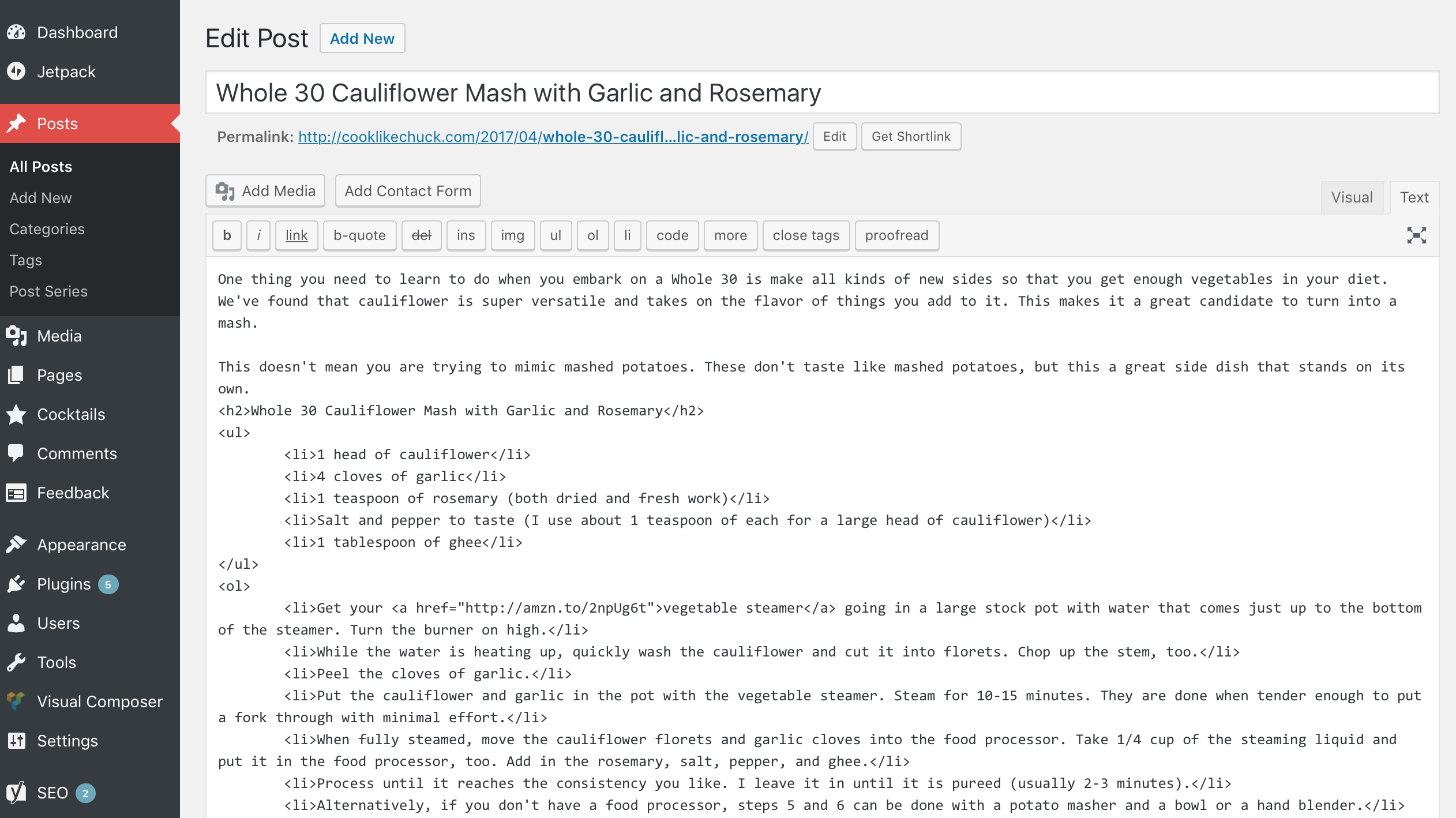
You’ll primarily use HTML in the content editor of Posts and Pages. When you are editing a post or a page, the editor has two options: Visual or Text. Visual comes up by default. If you switch over to the Text tab, you’ll see that your headers, lists, etc are marked up with HTML:
CSS is usually defined and applied in the
style.cssfile inside your WordPress theme folder. That said, if you are just starting out, I recommend you leave thestyle.cssfile alone and install the Jetpack plugin. It includes a module for adding custom CSS to your theme. There are two benefits for doing it this way:- Beginners should stay away from theme files because you can easily crash your site if you don’t know what you are doing. Changes made in the Jetpack CSS module don’t change your theme, they just apply changes on top of it. These changes are easy to remove, so you don’t have to worry about crashing your site.
- These changes are stored in the database, so they’ll bypass cache. Most hosts aggressively cache theme files, so changes made directly to
style.cssmight take some time to show up. Changes applied via Jetpack’s CSS module take effect as soon as they are saved. These changes are also usually applied last, so they take precedent over what is defined in your theme.
The free version of the Jetpack plugin is all you need. Once it is installed, you can click “enable recommended options” and the CSS module should be included in that. If it isn’t, go to Jetpack > Settings > Appearance and toggle on Custom CSS.
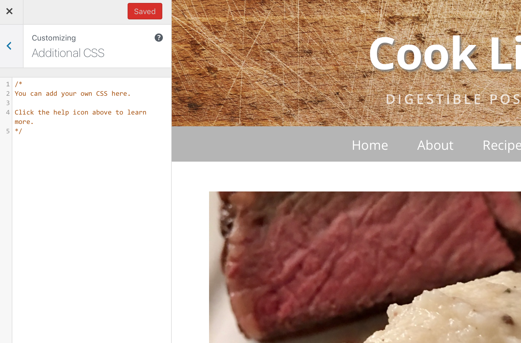
Once it is turned on, you can go to Appearance > Customize in your WordPress Admin sidebar. In the Customizer you’ll see an area for Additional CSS:
Questions
If you have any questions, drop them below in the comments! Or, you can ask them on Stack Overflow and Quora like the rest of the web does 🙂
-
When is the last time you sent a Thank You note?

“Send a thank you note” is one of those pieces of common wisdom we always hear, yet an astonishingly low number of people actually do it.
Let me give a recent example of how a thank you note (even a digital one!) can shape someone’s view of you.
A Tale of Two Groups
Over the past few weeks I emailed the same message to two different groups.
Group A is generally earlier on in their careers. Group B is generally more established in their careers. The email content, open rates, and link clicks were the same, but what stuck out to me was how differently the two groups acted after logging in. Only 2.4% of group A sent me a note afterward, whereas 55.5% of group B sent me a note afterward.
Building Social Capital
The majority of group A read and archived the email. The majority of group B took the interaction as an opportunity to build some social capital.
I didnt expect a reply and I don’t think less of those who didn’t reply. I don’t want to be presumptuous and think I’m important enough to warrant a reply. Heck, there are dozens of emails I just read and archive without responding to every single day.
That said, those who did reply gained some social capital with me. They stick out because they did something very few others took the time to do: Send me a nice note. With a 30 second email, they changed the way I think about them. I haven’t met any of them in person and I don’t interact with them on a daily basis, but I’m willing to go out of my way for those who did actually reply the next time they need help with something.
There is a strong correlation between those who replied and career success (even early in their careers). They know that consistently doing little things to build social capital makes asks and connections easier in the future. Most in group B (and a few in group A) have learned this lesson and made doing little things like this part of their standard operating procedure.
Even though sending a thank you note is common wisdom, few people go through the trouble of actually doing it. With Praxis, I work with a lot of bright young people. Most, even the ones who excel, never send a thank you note. The minority who do stand out.
What opportunities are you missing because you didn’t take 30 seconds to say thanks?
A big thanks to Isaac Morehouse for regularly encouraging me to follow this principle and for his notes and suggestions on an early draft of this post.
-
When is the last time you sent a Thank You note?

-
Yes, There are Stupid Questions

I field a lot of questions. I’m sure you do, too.
In a single day I might get asked about technology recommendations, programming syntax, software integrations, business processes, locating files, and how to set up WordPress. I don’t mind answering these questions, and I try to do so quickly and politely.
Here’s the kicker: At least 80% of these questions can be answered with a simple web search. There already dozens of tutorials, Stack Overflow threads, Quora answers, blog posts, FAQs, and documentation sections covering these topics that can be reached in a few clicks. Most of the time the person asking has not made any attempt to answer the question themselves. I consider these stupid questions.
Back in 9th grade, I asked Mrs. Dispenza a history question while I was doing my homework. She politely asked, “Where have you already looked to find that answer?” I sheepishly admitted that I hadn’t looked anywhere. What she said next has stuck with me ever since:
“You should never ask someone else a question without first attempting to answer it on your own.”
Of course there are exceptions to this. Someone assisting a surgeon in the middle of a surgery shouldn’t stop to research the best way to stop bleeding, he should just ask the surgeon. Sometimes asking a veteran staff member the best process for doing something is better than spending an hour figuring it out through trial and error. There are costs and benefits to every decision. Make sure the comparison lands on the “benefits” side of that scale if you are using someone else’s time and energy.
Do This Before Asking a Question
Before you ask someone a question in the future, follow this mental checklist to make sure it isn’t a stupid question:
- Is the answer this question worth taking someone else’s time and energy for? Will I waste social capital by asking this question?
- Did I make a good faith attempt to answer this question myself?
- Did I demonstrate to the person I’m asking that I tried to answer the question myself and try to pinpoint the source my confusion?
- Instead of asking for a solution to this specific problem, can I ask to be pointed to a resource so I can solve it myself? (Documentation, a specific book, a website)
How to Answer Stupid Questions
Answer politely and quickly
If your first instinct is to tell someone they should have looked the question up before asking you, The Dude has a message for you:

Always answer the question politely and quickly. Be nice and be helpful. Don’t be an asshole.
A crisis is not a time to teach a lesson.
Tensions run high when money and reputations are on the line, so clear thinking is rare during a crisis. When there is a crisis unfolding and someone asks you for help, step in, stay calm, and fix the problem. Don’t waste time teaching people how to research and solve issues on their own–you’ll only frustrate yourself and everyone else.
Follow up afterward with an after action report for the person or team. Detail what happened, what caused it, what the solution was, and what can be done to prevent this issue in the future. Also suggest some resources the person or team can study before the next crisis hits so that they will be better equipped to respond. This report should be added to your documentation or knowledge base. It will likely help everyone in the future.
Follow up with resources that person can use to dive deeper
After answering the question, pass along a book, article, video, or a guide where the questioner can learn more and refer to later.
If the same person asks the same question again in the future, consider responding, “Hey, I remember that we talked about this last week. Did you check out the blog post I sent you? Here is that link again: http://example.com/blog-post/”
Sometimes a dialogue is the best approach
Sometimes dialoguing leads people to answer their own question and sometimes it helps me figure out the source of their misunderstanding. I like to ask,
- “Where have you looked?”
- “What have you tried?”
- “What do you think the best solution is?”
Do you need better documentation?
If you keep getting the same questions over and over, your company or your project might need better documentation. This can come in many forms: Training materials, FAQs, instruction manuals, user guides, standard operating procedures, a wiki, etc.
If you have documentation, keep it up to date and make sure that all staff are kept up to date on additions and changes. Everyone needs to know it exists and referring to it needs to become part of the culture. If you don’t have documentation, make it a priority to write some! Documentation is everyone’s responsibility, not just HR’s.
-
Yes, There are Stupid Questions
-
Get the Most out of Your Kindle with These 4 Tools
Take screenshots, get reading statistics, export your highlights, and remove the ads from your Kindle
1. Screenshots
Did you know that you can take screenshots on most recent Kindles? This is useful for quickly sharing a passage, showing an editor or developer a display issue, and sharing tips in an article like this one.
To take a screenshot, tap on opposing corners at the same time.
https://gfycat.com/PointlessDistantDiamondbackrattlesnake
To retrieve these screenshots, connect the Kindle to your computer via USB. The screenshots will be saved in the main folder as .png files.
2. Reading Statistics with Kindle FreeTime
I’ve wanted reading statistics on my Kindle for a long time. It wasn’t available in the main settings, so I gave up on it and kept track of my reading on my own.
I stumbled across an article one day talking about the Parental Control settings on the Kindle. When parental controls are enabled, kids have a completely different reading experience. Only books that are enabled by the parent’s account are available, the parent can set daily reading goals for the child, and the child can earn achievements based on how much they read. Daily, monthly, and total reading statistics are also available!


The highlights you made in FreeTime are preserved in My Clippings.txt, but you can’t see them on the Kindle unless you are in FreeTime mode. Progress between FreeTime and regular mode are tracked separately, too.
I now pretty much only use my Kindle in FreeTime mode so that my reading statistics are tracked.
If you are a data nerd and want to crunch the data on your own, it is stored in a SQLite file on your device under system > freetime > freetime.db.
3. Export your Highlights and Notes with Clippings.io
The highlights and notes you make on your Kindle are saved on the device in a file named “My Clippings.txt”. You can access it by connecting to your Kindle to your computer via USB. If you take this file and upload it to Clippings.io, you can edit, search, tag and annotate these highlights. Then you can publish them to Evernote or export them to Word, Excel, plain text, or PDF.

4. How to Remove the Ads from your Kindle
The price of Kindles are partially subsidized by ad sales. They show up on your lock screen when the device is turned off and you get special offers based on what you’ve read recently.
I find these ads annoying. Thankfully, you can turn them off! It costs $20, but I think it is worth not seeing them ever again.
To remove ads from your Kindle, go to Amazon.com, click on Your Account, and click Manage Your Content and Devices. Select the Kindle you want to remove ads from. You’ll see your Kindle’s email address, serial number, etc. There will also be a section that says, “Special Offers / Offers and Ads” — Hit edit there and click unsubscribe.
Make sure your Kindle is connected to a network and has synced, then the ads will be gone! Instead you’ll see cool photos on your lock screen.
-
Taking a Day Trip to Joshua Tree from LA

Photo courtesy of the National Park Service Are you visiting LA for a few days and want to get out to see Joshua Tree? Taking a day trip from Los Angeles to Joshua Tree National Park is completely doable as long as you plan ahead. Here is what you need to know.
What you’ll need
- A full day: Joshua Tree is 2–3 hours East of LA and you’ll want at least 5 hours to go through the park. Add in meals and you’ve used a full day.
- A rental car: A car is the easiest way to get to the park and see things on your own schedule.
- Water and snacks: The desert is very hot, so water is necessary and salty snacks will help replenish those electrolytes. We purchased a couple gallons for the car and refilled our water bottles before each hike. These things aren’t readily available in the park, so plan ahead.
- Sunscreen: The sun is intense. Get some good sunscreen and reapply often.
- Comfortable clothes and shoes: You’ll want to get out and do some hiking. Even if you only take short, established trails, good footwear and breathable clothes will make your day more pleasant. Take a light hat if you don’t want to burn your forehead like I did.

Click here for a printable version of this map Itinerary
Amanda and I took this trip last weekend. Here is the itinerary we used. Feel free to use it as a base!
Mid-Morning: LA to Coachella Valley
Leave LA by 8am. Grab some coffee and a breakfast sandwich on the road, and set your GPS for Palm Springs or Indio. Turn on some tunes and settle in for a 2–3 hour drive. Cross your fingers that LA traffic won’t be too bad.
When you stop in Palm Springs or Indio, fill up your gas tank, pick up the water, sunscreen, and snacks if you haven’t already done so. Grab a quick sandwich if you are hungry because the park doesn’t have food.
Make sure to wrap up any cell phone communications before driving into the park. There is pretty much zero reception in the park, so plan accordingly.
Late-Morning: Cottonwood Spring
Enter the park from the south entrance at Cottonwood Spring. There are a few cool things to do there:
- Pick up some park merch at the visitor center.
- Check out the wildflowers and cacti around the visitor center.


- Drive down the road off to the right to Cottonwood Spring and do the short Mastodon Loop hike. You see some incredible views and the hike isn’t strenuous.
Early Afternoon: Ocotillo Patch and Cholla Cactus Garden
After your hike, hop back in the car and start driving north. Your first stop will be the Ocotillo Patch. These plants aren’t cacti, but deciduous shrubs. We saw hummingbirds visiting the flowers!


After the Ocotillo Patch, drive a little further north to the Cholla Cactus Garden. This is a dense area of cactus with a nice walking path. Pick up a guide at the trail entrance to learn about all the different Cholla varieties.

After admiring the Chollas, drive up to the White Tank campground. If you’ve been drinking enough water to stay hydrated, you’ll probably need to hit the restroom. There are primitive restrooms at most camping areas in the park.
While at White Tank, take a walk around the rock formations. Arch Rock Trail is a short half-mile loop.
This area is in the middle of where the park starts to transition from the Colorado desert environment to the Mojave desert environment. You’ll spot your first Joshua Trees around here!

Mid-to-Late Afternoon: Scull Rock, Jumbo Rocks, Desert Queen Mine, Sheep Pass, and Hidden Valley
After White Tank, drive a little further north, then turn West (left) at the main intersection toward Joshua Tree. There are a variety of things to do along this stretch of road:
- Climb around Scull Rock and Jumbo Rocks
- Admire the thousands of Joshua trees
- Go down a dirt road and hike up to the Desert Queen Mine
- Take a walk around Sheep Pass
- Hike around Hidden Valley
Take your time and take in the scenery. Have a few snacks between stops. This is one of the busiest areas of the park, but as long as you can find parking, you are just a short hike from solitude. We stopped many times along the road to admire cacti and Joshua trees.


Late Afternoon: Keys View
After a fun afternoon climbing on rocks and taking photos of Joshua Trees, hop back in the car and drive a few miles south to Keys View. It seems a little bit out of the way, but you get incredible views up here of the entire Coachella Valley. If you’ve timed your day correctly, you can admire the beginnings of a sunset from up here.

Evening
After Keys View, you can drive back to the main road and continue heading toward Joshua Tree and the park’s West entrance. Stop at Quail Springs for one last desert romp and then pull over to snap a few more photos of the incredible rocks as the sun is setting.

As you exit the park from the west entrance, resist the urge to stop at the first restaurant you see in Joshua Tree. Keep driving west for a few more miles to Yucca Valley. There are a ton more food options here and they are less likely to be packed with tourists. You can also drop by the Walmart or Walgreens to pick up some aloe for your sunburn.
Make sure you get the driver some caffeine for the journey back to LA. We expected it to take roughly two hours like on the way out, but we got caught in unexpected Sunday night traffic and it ended up taking three and a half hours to get back.
-
My WordPress Stack

IâÃÂÃÂve been building sites on top of WordPress and developing WordPress themes for the past five years. Here are the tools, hosts, themes, and plugins I use to build WordPress sites quickly and get the most out of them after they launch.
Total Theme
For the past two years, IâÃÂÃÂve used the Total theme as the base I build off of. IâÃÂÃÂve used more themes and theme frameworks than I can count, but Total is the one I keep coming back to.
I chose the Total theme because it is highly configurable, it has solid documentation, includes a bunch of premium plugins, and it has tons of hooks and filters that you can use to add in custom programming. Pretty much everything in the theme is modular, so it can be quickly customized and reused without cascading effects.
It is great to prototype with! All of the demos on the themeâÃÂÃÂs main site are built from the same theme with different configurations. You can install these demo options through the themeâÃÂÃÂs interface and build off of them. All of the customizations are able to be exported at JSON from the WordPress admin area, which makes it super easy to copy changes from staging to live.
The custom post types Total has included for Staff, Portfolio, and Testimonials are super useful. IâÃÂÃÂve expanded them to work for many things besides their traditional uses: job talent profiles, a collection of videos, a cocktail library, and book quotes.
Here are some sites IâÃÂÃÂve made using Total: Cook Like Chuck, AmandaKate.me, Nasty Design Co, MichaelMalice.com, RyanSosnow.skiArchived Link, The Commonwealth Partners, and Strong Roots NebraskaArchived Link.
Plugins
Here are the plugins that I use most often:
- Jetpack: This is built by Automattic, the same company that builds WordPress. It has a ton of useful features. I use their stats, image galleries, image CDN, brute force protection, spam filter, CSS editor, Markdown support, and the desktop and mobile apps. All of these features are free, but they will also back up your site and give you access to support if you pay for it.
- Visual Composer: This is the best WordPress page builder IâÃÂÃÂve come across. IâÃÂÃÂve used five different ones so far and this blows the other four out of the water. I also love that it has an API so that you can add your own features to it. It will work with almost any theme and it comes pre-loaded with the Total theme I mentioned above.
- WP Super Cache: WordPress is pretty heavy on server resource use. One way you can cut down on that is with caching. If you are a server admin like Eric Davis and have direct access to Apache, you can tweak your Varnish settings. If you are on a shared host, youâÃÂÃÂll need to install a caching plugin like WP Super Cache. This one is built by Automattic, the company that develops WordPress. The plugin builds static versions of your posts and pages, which are served directly to users instead of loading up the whole PHP engine for each pageview. Underpowered hosts and sites with heavy traffic will benefit most from this.
- Page Duplicator: This plugin allows you to make exact copies of posts, pages, and custom post types. This is super useful when you want to keep the layout and custom field values youâÃÂÃÂve created. IâÃÂÃÂm surprised it doesnâÃÂÃÂt come standard in WordPress.
- Yoast SEO: This is the best plugin out there for technical search and social metadata optimization. The free version is more than adequate. This isnâÃÂÃÂt an SEO magic wand: 80% of SEO depends on having great content people actually want to consume.
- Ninja Forms: This is very well designed, easy for non-technical people to use, and has a ton of extensions that allow forms you create to send data too the major tools you use.
Development
Development Environment
I primarily develop on virtual machines to keep my work from affecting my main machine. If something screws up, I can just delete the virtual machine and start over.
I use Virtual Box to run the VMs, Vagrant to manage them, and Laravel Homestead as my base development environment. WordPressâÃÂÃÂs famous five minute install instructions work perfectly on Homestead.
Staging and Production Environment
For large sites that I work on, I always make sure we have two separate environments running at all times: Staging and Production. The production site is the live one that customers access. The staging site is a copy of the live site where all major changes are applied and tested first (function additions, template changes, plugin testing, etc). The production site should never have code on it that hasnâÃÂÃÂt been tested on the staging site first. Hosts like WPEngine include a staging area with every install by default. On shared hosting services like A Small Orange or Bluehost, youâÃÂÃÂll need to set up a subdomain install to act as your staging environment.
IDE
Coda by Panic is my IDE of choice. IâÃÂÃÂve been using it since it first launched and I stuck through the major 2.0 (and subsequently 2.5) release. It has highlighting, remote editing and publishing (via FTP/SFTP/SSH), previewing, SQL connectors, Terminal, regex search, and git support built in. Tons of third party add-ons available. IâÃÂÃÂve written AppleScripts for it and know most commands by heart, so IâÃÂÃÂm unlikely to jump ship any time soon.
Use a Child Theme
Whenever you make any code changes to a WordPress theme, you should always do them from a child theme. Child themes allow you to change functions and templates and still preserve changes when the base theme is updated. Here is a child theme for Total.
Hosting
For Low Traffic
For low traffic sites, a shared hosting account is all you need. This means your site is hosted from a server that hosts multiple sites at once.
I use A Small Orange. I host Cook Like Chuck, AmandaKate.me, Nasty Design Co, and a theme staging area all on one of ASOâÃÂÃÂs Small accounts, which I pay $50 a year for. IâÃÂÃÂve had up to 100 distinct users on Cook Like Chuck at the same time without an issue (thanks, Reddit!). IâÃÂÃÂd probably feel comfortable up to 200-300 distinct users on an ASO site at the same time without sweating as long as things are properly cached (see plugins below). Anything more than that and youâÃÂÃÂll want to jump to something like WPEngine.
Never opt for the âÃÂÃÂTinyâÃÂàversion at A Small Orange. It is on cheaper, slower infrastructure, which is why the price is so low. It probably wonâÃÂÃÂt even handle up to 100 concurrent users.
ASO has great customer service. They are always available, even in the middle of the night!
For High Traffic
For high-traffic sites, I use WPEngine.
Praxis had a huge traffic surge at the beginning of March when Isaac Morehouse went on Tucker CarlsonArchived Link. At the peak of the surge, we had around 7500 concurrent users (i.e. 7500 different people hitting the site at the exact same time) and we had no decrease in performance on WPEngine. They aggressively cache and have super fast servers. Cook Like Chuck (on an A Small Orange Small account) would have crashed under that load, even with caching plugins.
WPEngine also has great customer support. They donâÃÂÃÂt let you tweak caching settings yourself, but a support agent will take care of it for you in minutes.
For the Server Admin
If you want to build out your own hosting environment, tweak caching settings, set up load balancers, etc, you can build out your own WordPress hosting environment on Amazon Web Services.
At eResources, we had a great experience with hosting high traffic WordPress sites on Rackspace. Their support is top-notch.
Backups
Hosts like WPEngine automatically make backup points every night. On shared hosts, I have a recurring task scheduled to download a backup every Friday. I keep weekly backups for a month and monthly backups for a year. I store these on an external drive that is synced up to Backblaze.
Domains
I use Hover for buying and managing domain names and most DNS management. I use Cloudflare for DNS management on domains that need SSL because I love their Flexible SSL plan.
What are your favorite WordPress tools? Let me know in the comments!
-
The Afternoon Check-in

On January 5, I started using Exist.io to rate each day from 1–5 and jot down a few notes about the day. The scale is pretty simple:
- 1: Terrible
- 2: Bad
- 3: Okay
- 4: Good
- 5: Perfect
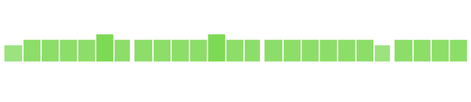
At the end of the month I looked back at the data I collected and I was a little bummed to see that there were so many 2 (brownish) and 3 (yellowish android green) days.

My Exist.io mood dashboard for January 2017. Brown is 2, yellowish green is 3, light green is 4, darker green is 5. I’ve always heard that your mood depends a lot on how you choose to interpret and react to situations. This means that we have a profound influence over moods, so I decided to take action and see how I can improve my mood ratings.
Starting February 1, I took a moment to pause each afternoon and ask myself two questions:
1. What is today’s mood rating so far?
2. What can I do to increase or maintain that rating?
Any time I found myself saying that today would be a 2 or a 3, I resolved to do whatever I could for the rest of the day to increase that rating to a 3 or a 4. If I thought today was a 4 or a 5, I resolved to spend the rest of the day doing things that would maintain that rating.
Data scientists typically don’t like it when active viewers influence the outcome of their collected data, but this isn’t science. The goal here is to be happier, so intentionally influencing your mood data for the better is a good thing.
The Results
Over the next two and a half months, these two questions have eliminated the #2 (bad) days, decreased the #3 (okay) days, and increased the #4 (good) and #5 (perfect) days.


Mood data from Exist.io. Yellowish green is 3, light green is 4, darker green is 5. Yes, there are still 3s on this chart. February in particular was a frustrating month. But every single one of those 3s were brought up from a would-be 2 that I intercepted with my mid-afternoon check-ins. This made February so much better than it would have been.
How you can implement an Afternoon Check-in
- Subscribe to Exist.io or use your current favorite journaling/tracking system to rate you mood from 1–5 every day. You can even use a calendar for this. Something with the ability to see the overall trend is helpful.
- Set a reminder on your phone or a calendar alert for 3:30pm every day. When it goes off, as yourself these questions: What is today’s mood rating so far? and What can I do to increase or maintain that rating?
- When you encounter anything lower than a 4, write down three things you can do to improve that rating by the time you go to bed. When you encounter a 4 or 5, write down three things you can do to maintain that rating by the time you go to bed. The goal is to make a bad day better or to continue having a good day.
- Right before you go to bed, write down the final rating for the day and write down a few notes about the day.
- Review your ratings once every two weeks. If you aren’t seeing an overall mood improvement, it might be time to reassess and take a look at the underlying causes of stress, anxiety, and frustration in your life. Then make removing those things the focus of your afternoon check-in.
Remember that you are in the driver’s seat of your own mood, not the passenger’s seat. Take the wheel.
-
The Afternoon Check-in
-
How to Hit Reset and Keep Going

We’ve all been there: It is 4:30pm, our energy is low, we have at least four hours of work left to do, and we feel like giving up and taking a nap.
In that moment, we must make a critical decision: Do we keep going and get our work done or throw in the towel, knowing we will pay the price later?
If it were five hours earlier, the work would be no problem. A fresher, more energetic version of ourselves earlier in the day had what it took to knock this stuff out. The trick is to get back into that earlier state of mind.
Here is what I do to hit reset and keep going:
Change the body, change the mind
“The difference between peak performance and poor performance is not intelligence or ability; most often it’s the state that your mind and body is in.” — Tony Robbins
One of the things Tony Robbins talks about is the connection between your body and your mind. Your physical state has a huge impact on your mental state.
When your mind is feeling in a slump, your posture is likely slumped over, too. Your breathing is probably shallow. If you change these two things, your mindset will shift, too.
Here is the physiological checklist I go down when I’m feeling sluggish:
- How is my posture? Stand up straight, move from the chair to the standing desk.
- Do I need to roll my back? If my posture has been off for a few hours, I like to get out my foam roller and arch my back for 90 seconds and then roll it out for another 90 seconds.
- How is my breathing? Am I breathing deeply enough? Do I need to do 2–3 minutes of box breathing? Try breathing in sync with this gif. Breath in, hold, breath out, hold, repeat.

- Do I need to stretch? Try doing 30 seconds each of your favorite stretches.
- Do I need to get my blood pumping? Try running some stairs, swinging a kettlebell, doing some burpees, or doing some old-fashioned jumping jacks.
- Do I need to rehydrate? I’m terrible about drinking enough water. Sometimes I’m just dehydrated and need to drink a glass of water.
- Do I need to do a power up? After reading Super Better by Jane McGonigal, I was sold on power ups: Little things that are easy to do and make you feel better. Mine are 1) Stretching my arms to the sky for ten seconds (physical) and 2) Watering and the house plants (emotional).
- Do I need to take a cold shower? A cold shower will radically shift your state of mind. At the end of a normal shower, I like to turn the temperature as low as it will go and stand there for two minutes. It gets me ready to start the day. It will also pull you out of the fog of malaise.
Get a change of scenery
Sometimes working at the same desk all day just doesn’t work well for me. Being in a physically different place helps.
- Try moving from your desk to a conference table. Or, if you are like me and both live and work in a small one-bedroom apartment, switch to your kitchen table instead of your desk.
- Go work from a coffee shop. Getting out will be nice and and extra caffeine boost won’t hurt, either. I don’t have any good coffee shops within walking distance of me, so when I can’t take the time to drive to one, I go work from the local brewery. I have the wifi password and I order the lowest ABV % beer on the menu and nurse it. Always leave the bartender a hefty tip since you are taking up a seat.
Sometimes a break is necessary. Just make sure the break is helping you reset instead of just prolonging the struggle.
- Go for a walk. Sometimes a break is necessary. Just make sure the break is helping you reset instead of just prolonging the struggle. Going for a walk is more likely to get you in a better frame of mind than watching Netflix and surfing Facebook. While you walk, breathe in fresh air, take in some different sights and sounds, get your blood pumping, and let your struggles go for 15–30 minutes. You’ll come back ready to work.
Remove distractions
Our lizard brains love to be distracted by anything and everything. Removing them and making them harder to reach will lower the barriers to focus.
- Put your cell phone out of reach. Mine sits on a table out of my normal reach while I’m working so that I don’t mindlessly surf Instagram all day.
- Install a social media and news site blocker. I use WasteNoTime in Safari and Chrome.
- Close email, Slack, and Skype. Keeping in touch is great, but sometimes you need to disconnect to get real work done.
Get into work mode
Think back to the last five times you’ve had to buckle down and get some work done? Is there something you do that signals “it’s time to work”?
For me it is putting my headphones on and turning on Beaucoup Fish by Underworld. I only listen to this album when I’m working. I’ve done the same thing f0r the last 15 years. It has a Pavlovian effect on me now.
Make a plan
Now that your body is good to go, you’ve gotten a change of scenery, you’ve removed your distractions, and you’ve put yourself in work mode, it is time to make a plan to dig yourself out of this hole.
- Pare your task list down to essentials. If you don’t have a task list, make one. Your tasks will seem must more doable once they are on paper and not just lurking around like monsters in your head. If you do have a task list already, put things into two categories: What absolutely needs to get done today? and What can actually be done later? Sometimes we think things must get done today, but in reality there will be no consequences if they are pushed to the next day. Figure out what must be done today so you can focus on that.
- Figure out the best order to accomplish these items in. I’m a big fan of eating the frog (doing the most important and difficult thing first), but sometimes things need to be done in a specific order.
Build momentum
Take the first step, then the second, then the third. The whole journey is composed of simple steps.

Once your list is made, take the first step to completing the first item. Then the second step. Then the third. Then the fourth.
Once the first item is completed, don’t take a break to check your email. Keep your momentum rolling and take the first step on your second item. Then the second step. Then the third.
Once a ball is rolling, it doesn’t stop easily. You’ve got this.
-
How to Hit Reset and Keep Going

-
My Setup and Tools
I often get asked about what I use to get my work done. This post will be updated regularly with my current toolkit and setup.
Last updated: April 11, 2017
This list is broken into these major categories:
Web Development
Coda and TextWrangler
Coda by Panic is my IDE of choice. IâÂÂve been using it since it first launched and I stuck through the major 2.0 (and subsequently 2.5) release. It has highlighting, remote editing and publishing, previewing, SQL connectors, Terminal, regex search, and git support built in. Tons of third party add-ons available. IâÂÂve written AppleScripts for it and know most commands by heart, so IâÂÂm unlikely to jump ship any time soon.
TextWrangler is the text editor I launch if I just need to take a peek at something or quickly clean up some formatting. It is built on the BareBones engine and is ancient, but awesome.
Virtual Box + Vagrant + Homestead
I primarily develop on virtual machines to keep my environments separate. I use Virtual Box to run the VMs, Vagrant to manage them, and Laravel Homestead as my base development environment.
Jekyll & WordPress
This site is powered by Jekyll and cooklikechuck.com is powered by WordPress.
A Small Orange, WPengine, and Amazon Web Services
- This site is hosted on Amazon S3 and Cloudfront.
- Most of my various WordPress sites are hosted on A Small Orange. On ASO, go with the Small version, not the Tiny version.
- PraxisâÂÂs high-volume WordPress sites are hosted at WPengine.
Hover and Cloudflare
I use Hover for buying and managing domain names and most DNS management. I use Cloudflare for DNS management on domains that I need SSL on because I love their Flexible SSL plan.
Homebrew
I use Homebrew for package management.
Desktop apps
Backblaze & Carbon Copy Cloner
I use Backblaze for my offsite backup solution and Carbon Copy Cloner with miscellaneous Western Digital and Seagate drives for my onsite backups.
CleanMyMac and Hazel
I use CleanMyMac once a week to clean out the junk that accumulates. I keep Hazel rules running constantly to automate organization on my Mac. The MacSparky Hazel Field Guide will teach you everything you need to know about it.
1Password
I use 1Password for secure password management. IâÂÂve also tried LastPass and Dashlane, but nothing can beat 1Password, both in terms of security and easy of use. IâÂÂve also use 1Password for Teams and it works just as well.
TextExpander
TextExpander has radically changed the way I work. If you ever type something more than once, make a snippet for it and save your keystrokes. I also launch scripts and templates from a few keys with this tool. We also recently adopted it at Praxis to keep our customer service answers consistent across staff members.
Raindrop.io
IâÂÂve searched for years for good bookmark management. Raindrop.io is exactly what IâÂÂve been searching for. I dropped Pocket and Instapaper entirely in favor of this.
Private Internet Access
We all need a good VPN, both for privacy and for development QC testing. IâÂÂve been using Private Internet Access for the past four years and am happy with it.
Setapp
Setapp is a subscription tool for Mac apps. $10 a month gets you access to a ton of great apps. Here are the apps I regularly use from the Setapp bundle:
- Paste
- Gifox
- CleanMyMac
- Gemini
- Marked
- CodeRunner
- Expressions
- Sip
- Squash
- Ulysses
- Blogo
- SQL Pro Studio
- Forecast Bar
- Be Focused
- Capto
- Base
- Unclutter
Miscellaneous macOS apps
- Flycut for clipboard management
- Sip for color picking and management
- Bartender for menu bar organization
- Little Snitch for monitoring my computerâÂÂs network traffic and Micro Snitch for monitoring microphone usage.
- Unclutter for taking quick notes
- Spark for desktop email
- RescueTime for app usage statistics
- iA Writer for general writing. I almost always write in Markdown and export to HTML or PDFs.
- Amphetamine is the app I use to keep my Mac awake. I use this over Caffeine because it has more triggers and automation options.
- Screenshot PlusArchived Link for taking screenshots, automatically uploading them to Dropbox, and then copying the URL directly to my clipboard.
Browser Extensions
I use Safari, Chrome, and Firefox on a daily basis for browsing and testing. Here are plugins I use that make my life easier:
- Hubspot Sales for email open tracking in Chrome
- What Font? for font identification in Safari and Chrome
- Ghostery to prevent tracking in Safari and Chrome
- AdBlock to block ads in Safari and Chrome
- Wappalyzer to identify web technologies in Chrome and Firefox
- DownThemAll for bulk file downloading in Firefox
Hardware
- Standing desk that my Dad and I built
- iPhone 6S Plus with an Apple leather case
- Anker Battery Pack for on-the-go charging. This lives in my backpack.
- Kindle Paperwhite is where I do about 75% of my reading. I manage my highlights with Clippings.io
- Withings Activite for activity tracking
- 2013 15â MacBook Pro + Griffin stand
- Dell 27â 4K external monitor
- Tom Bihn Synapse 25 backpack
- Canon 40D + various Canon, Sigma, and Tamron lenses for shooting photos
- Muji A5 Dot Notebooks for taking notes, brainstorming, and making lists
- Karma GoArchived Link is the wifi hotspot I use. I collect data for sharing my connection and donâÂÂt need a contract.
-
Adding Full Width Front Page Widgets to Genesis Themes
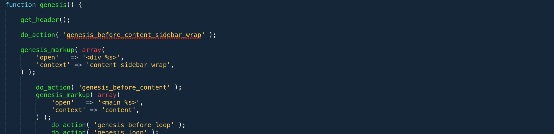
The Genesis Framework is super useful out of the box, but what if you want to color outside the lines?
Two weeks ago my coworker Derek Magill asked me to take a look at this awesome full width box on GrooveHQ’s website that has a testimonial box on one side a video on the other. This goes edge-to-edge, which means that it is impossible to make in most Genesis themes out of the box.

The Solution
We want this to display on the front page, which means it needs to be a front page widget. I prefer hardcoding as little design details as possible in order to leave things as flexible and as reusable as they can be. This means that that architecture decision I chose is to not build the widget with dedicated area for the testimonial and video, but to just make the widget span the width of the full window instead of being constrained to the container. Everything else is going to be handled by HTML and Javascript inside the widget. That way we can reuse the full width widget for something else later if we no longer want the video.
1. Register the widget area
In WordPress, you register things inside
functions.php. Make sure you do it in your child theme, not the main Genesis parent theme. Since Genesis typically comes pre-loaded with 5 widget areas, I opted to give this one the IDfront-page-6. You can choose whatever you want, but make sure you carry the same ID all the way through:genesis_register_sidebar( array( 'id' => 'front-page-6', 'name' => __( 'Front Page 6', 'showcase' ), 'description' => __( 'This is the 6th section on the front page. It is full-screen.', 'showcase' ), ) );2. Output the widget area on the front page
In Genesis themes, the front page template is usually named
front-page.php. This is where we’ll be putting this snippet. Find where the other front page widgets are output and add your new one in where you want it. Remember that in hard coded theme templates, the order matters. If you want it before all the other widget areas, you need to put the code that runs it first.A normal widget area that doesn’t go full width would look like this:
genesis_widget_area( 'front-page-6', array( 'before' => '', ) );But if you want to remove the padding around the edges of the widgets that keep them vertically in-line with the rest of the content, you’ll need to remove the
and one of the closingtags. Also remove the
flexible-widgetsclass.genesis_widget_area( 'front-page-6', array( 'before' => '', ) );3. Add the classes you created to your theme’s style.css
Here is what I opted to add:
.front-page-6 { background-color: #d64745; color: #fff; } .Aligner { display: flex; align-items: center; min-height: 24em; justify-content: center; } .Aligner-item { flex: 1; } .Aligner-item--top { align-self: flex-start; } .Aligner-item--bottom { align-self: flex-end; } .Aligner-item--fixed { flex: none; max-width: 70%; }I took the flexbox aligner styles from Philip Walton’s Github. I started using CSS back in version 1, so I’m still not used to this flexbox voodoo.
4. Add the content to the front page widget
The widget won’t become active until content there is a widget added to it. If you are going to put HTML and Javascript in it, choose a Text widget. Paste your code in there. Here is what I cooked up for our video testimonial box:
If you are looking for a great video hosting platform with a ton of options (like responsive embeds and private access), check out Wistia.
The Result
This isn’t ready to go live on the site yet because we are working on new videos to put in the block, so here is a screenshot with demo content. You’ll notice that I made the video a little larger than the text box (2/5 vs 3/5) because I wanted the focus to be on the video.