Today I learned about Many-to-Many relationships in relational data models
A many-to-many relationship is a type of cardinality that refers to the relationship between two entities A and B in which A may contain a parent instance for which there are many children in B and vice versa.
For example, a recipe may have many ingredients and a specific ingredient may be used in many recipes.
In SQL, this relationship is handled by an associative table. The primary key for this type of table is composed of two different columns, both of which reference columns in other tables that you are associating together.
It is a good convention to name these associative tables by how they reference each other: Table1_Table2
A SELECT statement on an associative table usually involves JOINing the main table with the associative table.
If you don’t want to run these JOINs every time, create a view first. A view is a virtual table based on the result-set of an SQL statement. You can add SQL functions, WHERE, and JOIN statements to a view and present the data as if the data were coming from one single table.
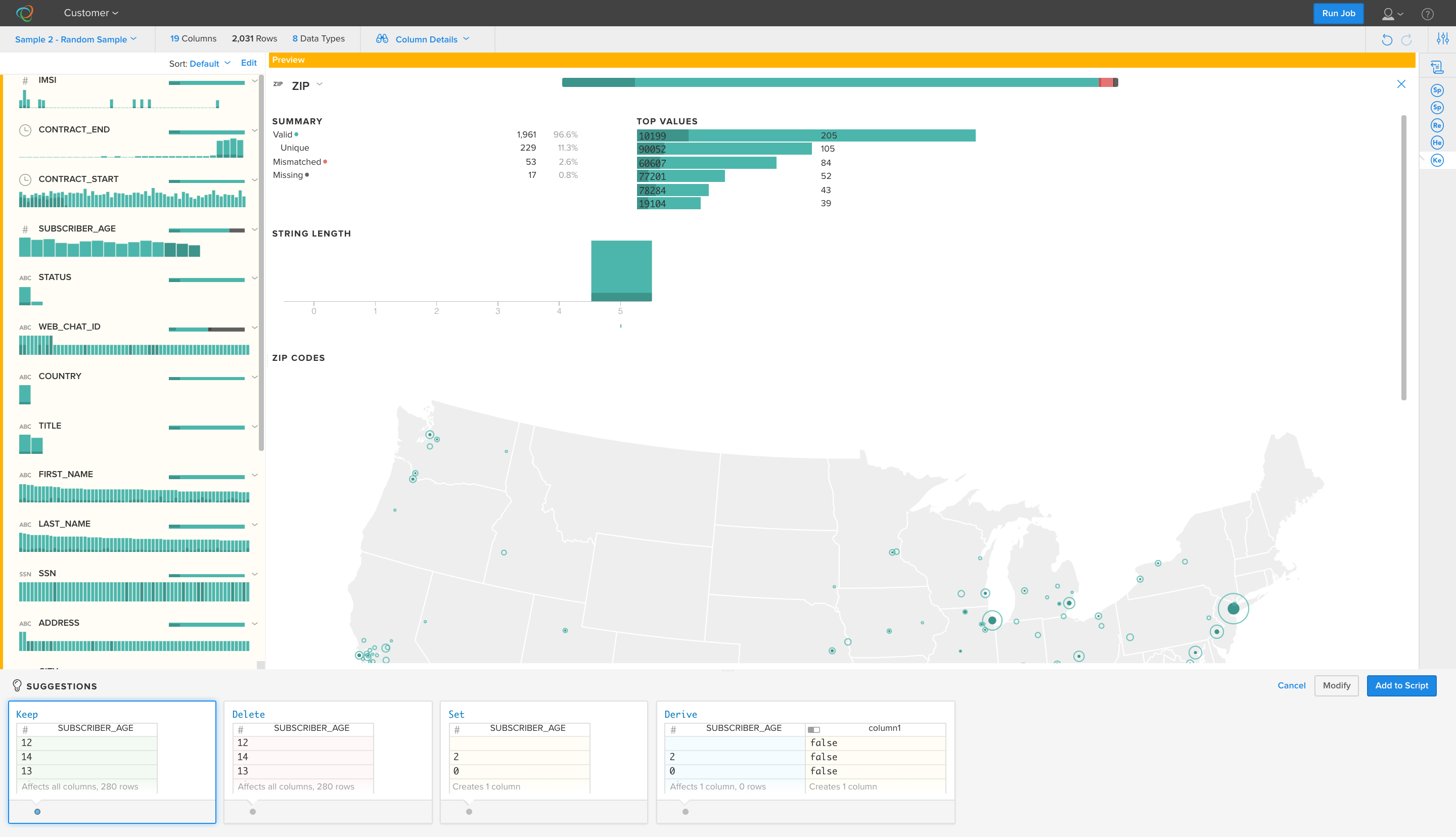
Trifacta Wrangler is a free program (currently in beta) that helps you clean up data sets and gives you a first cut at basic analysis. It is great for quickly turning messy data into structured, manageable formats.
In the past few days I’ve used it to analyze huge log files and turn messy JSON in structured CSVs that I could import into SQL.
Quick tips:
splitrows always has to come first. The program usually tries to split by \n (new line) first, but that doesn’t always work for JSON. Try splitting by something like },{, or do a quick find and replace ( },{ for }|||{ ) and do the split by ||| if you want to keep the curly brackets for an unnest.
unnest is very powerful for splitting out JSON values out into separate columns titled by their keys.
flatten works better than unnest in cases where the JSON does not have keys. It creates new rows and repeats other values in adjacent columns to keep the relation. This works well if you have an ID column and are going to eventually stuff things into a relational database.
Hazel is a preference pane-based application that helps you automate organization on your Mac.
Within a few hours of using Hazel, I was able to clean out my 1000+ file Downloads folder, tame my unruly Desktop, get rid of all the trash that accumulated in my home folder, and organize my stashes of client files. I also set up rules for the future that will keep these places neat and orderly.
The next step is to turn my gaze on my photo library to create one master repository.
Data scientists notoriously hate word clouds. Besides for figuring out what the top 2-3 words are (because they are the biggest), it is difficult to see how much one word is used relative to another. Unfortunately, clients and non-data people love word clouds and sometimes insist on them. What is a self-respecting data nerd to do?
Pair it a word frequency chart!
The easiest way to do this is by using Python’s counter:
Counter(words).most_common()
Then you can use your favorite charting tool to make a bar chart of the results. I prefer D3.js.
Results
If you see both together, you get a better understanding of the words being used. Of course, a single word doesn’t always capture sentiment. They can be helpful in smaller data sets, but sometimes common phrases are more helpful in larger data sets. For common phrases, use n-gram analysis.
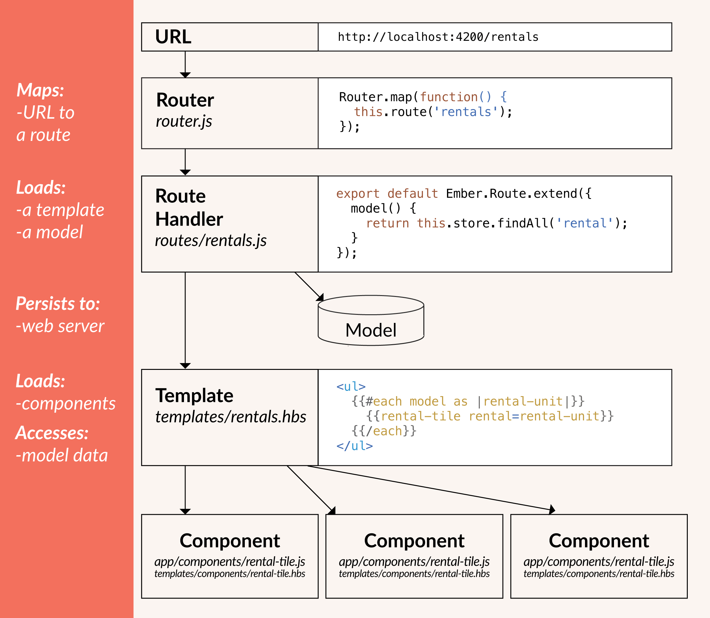
Ember.js is an open-source Javascript framework with the Model–view–viewmodel pattern.
Ember is an opinionated framework. This means that most architectural design decisions have been made for you by the developers of the framework. The advantage of this is that anyone who knows Ember can load your code and understand within a few minutes what is going on.
Core Concepts
Ember router maps a URL to a route handler
Route handler renders a template, then a model that is available to the template. Templates use Handlebars syntax.
Models save data in a “persistent state”, which is fancy language for putting it in a database or data store of some kind.
Components control how the UI behaves. They have two parts: A handlebars template and a javascript source file that defines the behavior.
Installing and running a project
Install:
$ npm install-g ember-cli@2.6
Creating a new app:
$ ember new
Starting the development server. You must be in the project folder (cd to it). It will serve on http://localhost:4200/
How to make link posts (or external post links) with Jekyll
I’m an avid reader of Marco.org and Daring Fireball. They both have these nifty posts that link directly to external pages. Now that I have two blogs, a podcast, and occasionally have work published elsewhere, I want to keep a record of these things on my cagrimmett.com blog. Link posts are an excellent way to do that.
Jekyll doesn’t have this capability out of the box, but with a little Liquid magic you can make it happen. I followed Christian-Frederik Voigt’s method. This takes advantage of the ability to create items in each post’s YAML front-matter and use them in template files:
First, create a variable called link: in your YAML front-matter for the post you want to link elsewhere. Fill it in with the link you want to post to link to:
Then anywhere in the template files that generates post headlines, you’ll need to write a conditional to check if the new link: variable is present. If it is, you’ll want to write the headline’s link there (post.link) instead of the post.url. I also added an arrow inside another conditional to specify that this is an outgoing link:
This method works great if you want to have direct links to other places and don’t want a permalink page on your own site that you can reference. I don’t care about that, so I didn’t make this for my site. If you want that, you’ll need to refer to Christian-Frederik Voigt’s method. The short story is that you’ll also need to modify the post and page templates.
Jekyll has a built-in filter called jsonify to turn data into JSON and Liquid has a filter called json. These is pretty useful for turning standard Jekyll output arrays into JSON, but if you need something more customized, you’ll need to build it yourself because Liquid’s ability to create arrays is limited. (Not a criticism, just an observation. It is primarily a templating language.)
For example, I wanted to store the dates I have blog posts for and the number of posts on each of those dates in order to pass it to a heatmap calendar. I couldn’t figure out a way to build that into a single array with Liquid (and I didn’t want to drop down into Ruby), so I figured out a way build JSON manually.
This outputs my blog’s post dates in the Unix timestamp format and displays the number of posts on a given day and leaves the trailing comma off to comply with the JSON standard:
The key to getting the counts right was advancing the counter by 1, comparing the date of the current post to the previous post, outputting the date and the count if they did not match, and if they did match advancing the counter by 1 and comparing again. After the date and count are output, the counter is reset to 0.
Thanks to Eric Davis for advice on using less code and pointing out how I can make the trailing comma if statement more efficient: %if forloop.last == false% , %endif%
He said:
If there’s one bit of “programming advice” I would give to anybody mucking around with this stuff, it’s this: Write as little code as humanly possible. The most bug-free line of code is the line not written.
What I need to ask myself: If something is being repeated, why?
I’m working my way through some data science and visualization books right now. I found that I learn better by doing small projects than I do by copying examples in books, so I designed a little project to apply some of what I learned and to learn some new skills along the way.
My goal was to make a project where I do everything from start to finish: Create my own data set, format it, analyze it, then visualize it. I also wanted to make it fairly common and as automated as possible so it could be repeated by others.
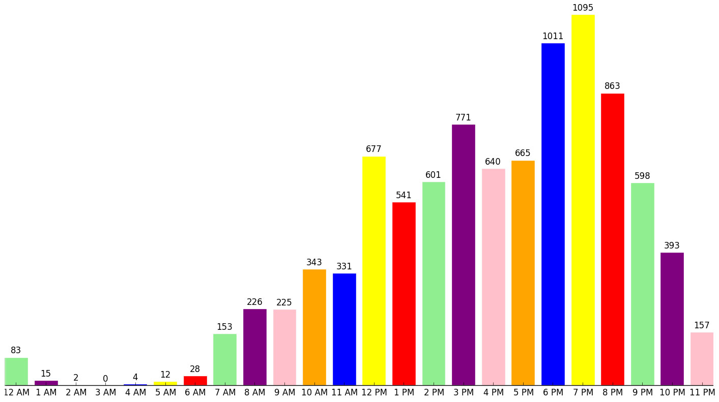
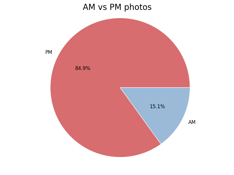
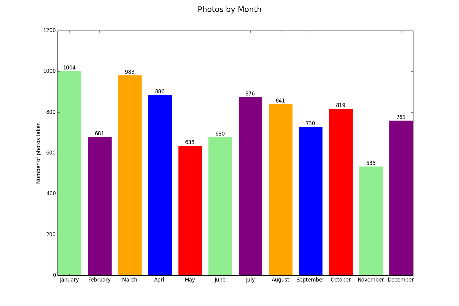
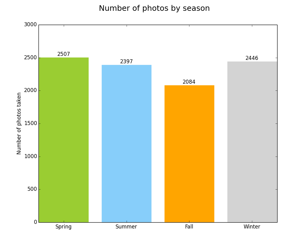
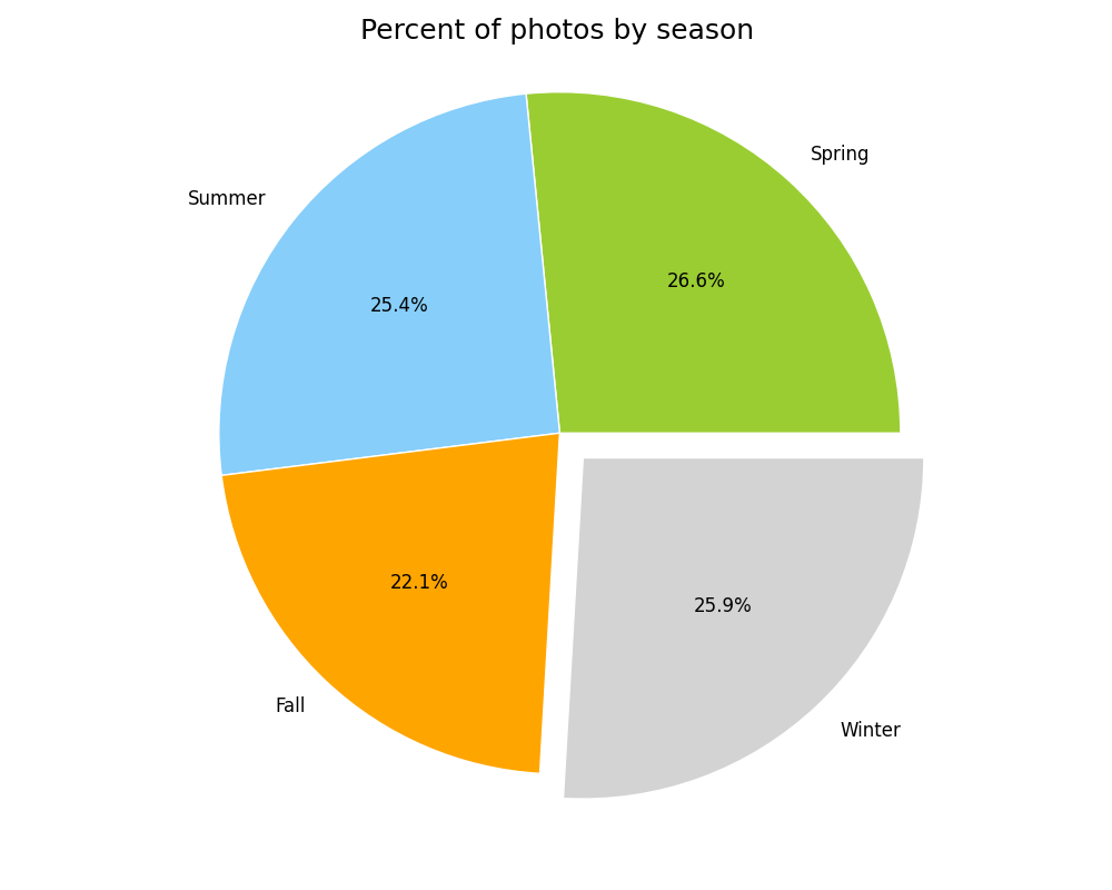
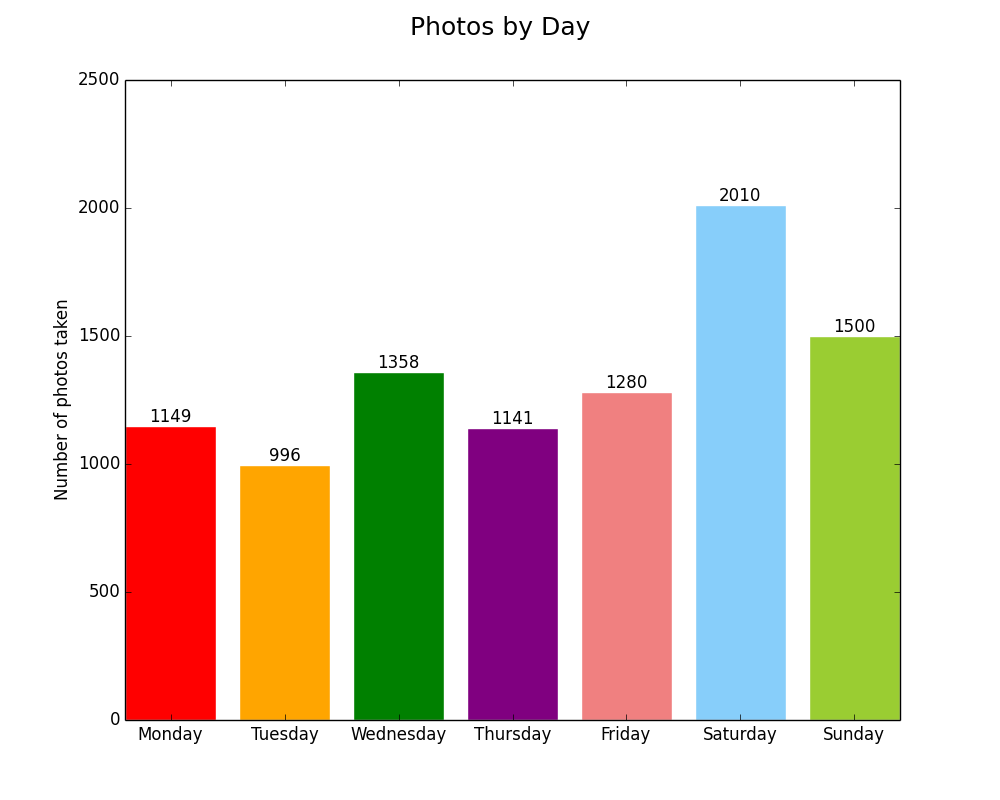
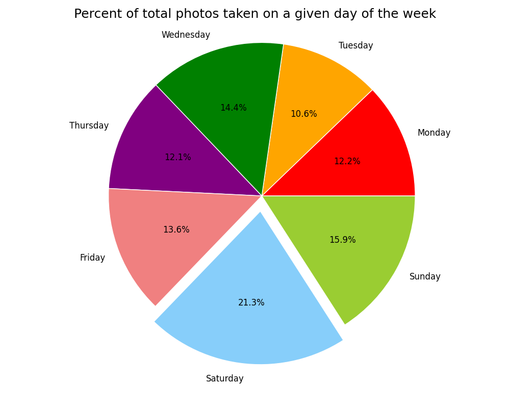
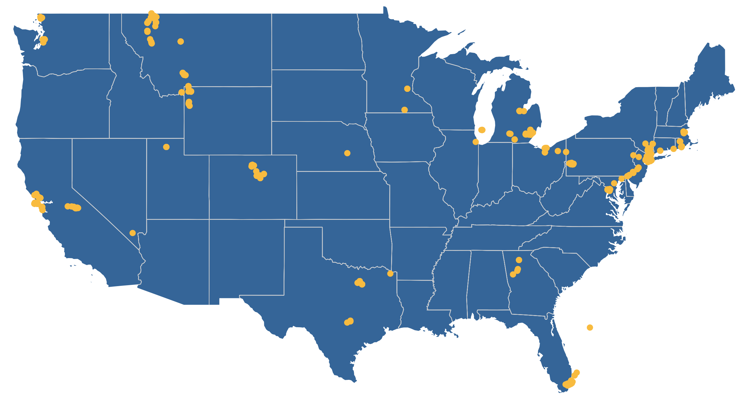
Here is what I came up with: Extracting metadata from my iPhone photos, analyzing it in different ways (days, months, hours, seasons), and visualizing it. I used free tools to do the extraction, formatting, and visualization, then scripted everything with AppleScript and Python to automate it.
Technical Details
You can find the full repository on GitHub. If you have a recent Mac with Photos.app and TextWrangler, you can run the scripts and produce your own charts!
I used AppleScript to loop through photo metadata in Photos.app and write it out to a CSV files that it creates in the same directory as the scripts.
I used TextWrangler’s grep functionality via AppleScript to break apart the date strings into days of the week, dates, and times, and to remove bad or null location strings (lat,long). I know I could have written this in Python, but I didn’t want to reinvent the wheel. TextWrangler’s AppleScript library is very powerful and easy to use.
Python was my tool of choice for analyzing the CSV files in various ways and visualizing the results with one of its plotting libraries, matplotlib.
The map of where photos were taken in the US was generated with D3.js.
Once everything has been generated and saved, AppleScript opens the images in Preview and launches a simple Python webserver to show the map.
The Results
Lessons
I really beefed up my understanding of basic Python (with help from Eric Davis!)
I dusted off my AppleScript knowledge and gave it a workout. I learned that AppleScript has a concept of lists that you can pass into and out of programs. This was the key to launching all of the charts in a single preview window.
This was a great exercise in UX. How can this be both easy to use and easy to interpret?
This was an exercise in thinking programatically. How can this be built in a way that makes it reusable?
I learned how to project location information onto a map with D3.js. I’ve used D3.js for charts before, so this was a good way to expand my skills.
This was a good way to practice my git skills and think through how to structure a project and make executable code.
There is a lot more I can add to this (more mapping options, more ways to count the photos, outputting the photos in a calendar heatmap), but I feel comfortable stopping and moving on because I learned what I wanted to from it and I’m ready to start a new project. I might come back to this in the future and I might not, but either way I’m happy with this.
Cavaets
This analysis is not scientific, it was for fun. Since my photos were taken with different cell phones across non-controlled time periods, I can’t use this analysis to say things like, “I’m more likely to take photos in the spring than the fall.” The truth is that there are photos in here from three springs but only two falls.
I can’t guarantee that my code will work for everyone. It is still a little buggy and hasn’t been tested for all scenarios. I know this and know how I would test it, but this project isn’t big enough to warrant it.
The color palettes I used aren’t bulletproof. If you use F.lux or Night Shift the yellows will blend in to the screen, and if you have visual impairments you might not be able to distinguish between the greens and blues.
Try it for yourself
You can download the repository from GitHub and run it against your Photos.app library. The requirements and instructions are in the README. Let me know if you have any issues and I’ll do my best to help you out.
Last year Amanda and I went to Montana for a week in early May. We started in Yellowstone and then went up to Glacier. It was before the official start of the season and Going to the Sun Road was still closed, but we avoided the crowds, explored the park in solitude, took in the wonderful scenery, and ran into some incredible wildlife.
Here is the best of what I shot over three days in Glacier.
I started a simple Python http server as a background process at the end of a Python script. That was a mistake. Since it isn’t running in an open Terminal window, it is easy to forget about and it will run until you kill the process or reboot your machine. I don’t like that.
Here is how to identify and kill background Python processes in Terminal.app:
Here is a minimalist responsive bar chart with quantity labels at the top of each bar and text wrapping of the food labels. It is actually responsive, it doesn’t merely scale the SVG proportionally, it keeps a fixed height and dynamically changes the width.
For simplicity I took the left scale off. All bars are proportional and are labeled anyway.
Go ahead and resize your window! This has a minimum width of about 530px because of the text labels. Any smaller than that and they are very difficult to read.
The basic HTML
id ="chartID">
The Styles
You’ll see that the axis is actually there but it is white. I found it useful to learn to draw it, but I didn’t want it so I am keeping it hidden.
vardata=[{"food":"Hotdogs","quantity":24},{"food":"Tacos","quantity":15},{"food":"Pizza","quantity":3},{"food":"Double Quarter Pounders with Cheese","quantity":2},{"food":"Omelets","quantity":30},{"food":"Falafel and Hummus","quantity":21},{"food":"Soylent","quantity":13}]
The Javascript Heavy Lifting
This is where D3 really comes in.
Setting the margins, sizes, and figuring out the basic scale.
Setting the axes
Drawing the basic SVG container with the proper size and margins
Scaling the axes
Drawing the bars themselves
varmargin={top:10,right:10,bottom:90,left:10};varwidth=960-margin.left-margin.right;varheight=500-margin.top-margin.bottom;varxScale=d3.scale.ordinal().rangeRoundBands([0,width],.03)varyScale=d3.scale.linear().range([height,0]);varxAxis=d3.svg.axis().scale(xScale).orient("bottom");varyAxis=d3.svg.axis().scale(yScale).orient("left");varsvgContainer=d3.select("#chartID").append("svg").attr("width",width+margin.left+margin.right).attr("height",height+margin.top+margin.bottom).append("g").attr("class","container").attr("transform","translate("+margin.left+","+margin.top+")");xScale.domain(data.map(function(d){returnd.food;}));yScale.domain([0,d3.max(data,function(d){returnd.quantity;})]);//xAxis. To put on the top, swap "(height)" with "-5" in the translate() statement. Then you'll have to change the margins above and the x,y attributes in the svgContainer.select('.x.axis') statement inside resize() below.varxAxis_g=svgContainer.append("g").attr("class","x axis").attr("transform","translate(0,"+(height)+")").call(xAxis).selectAll("text");// Uncomment this block if you want the y axis/*var yAxis_g = svgContainer.append("g") .attr("class", "y axis") .call(yAxis) .append("text") .attr("transform", "rotate(-90)") .attr("y", 6).attr("dy", ".71em") //.style("text-anchor", "end").text("Number of Applicatons"); */svgContainer.selectAll(".bar").data(data).enter().append("rect").attr("class","bar").attr("x",function(d){returnxScale(d.food);}).attr("width",xScale.rangeBand()).attr("y",function(d){returnyScale(d.quantity);}).attr("height",function(d){returnheight-yScale(d.quantity);});
Adding the quantity labels to the top of each bar
This took me a while to figure out because I was originally appending to the rect element. According to the SVG specs this is illegal, so I moved on to appending them after everything else to they’d show on top. The positioning is tricky, too. I eventually found the correct variables to position it close to center. Then text-anchor: middle; sealed the deal.
// Controls the text labels at the top of each bar. Partially repeated in the resize() function below for responsiveness.svgContainer.selectAll(".text").data(data).enter().append("text").attr("class","label").attr("x",(function(d){returnxScale(d.food)+xScale.rangeBand()/2;})).attr("y",function(d){returnyScale(d.quantity)+1;}).attr("dy",".75em").text(function(d){returnd.quantity;});
Responsiveness
The general method for making D3 charts responsive is to scale the SVG down proportionally as the window gets smaller by manipulating the viewBox and preserveAspectRatio attributes. But after digging around on Github for a while, I found a fancier solution that preserves the height and redraws the SVG as the width shrinks.
document.addEventListener("DOMContentLoaded",resize);d3.select(window).on('resize',resize);functionresize(){console.log('----resize function----');// update widthwidth=parseInt(d3.select('#chartID').style('width'),10);width=width-margin.left-margin.right;height=parseInt(d3.select("#chartID").style("height"));height=height-margin.top-margin.bottom;console.log('----resiz width----'+width);console.log('----resiz height----'+height);// resize the chartxScale.range([0,width]);xScale.rangeRoundBands([0,width],.03);yScale.range([height,0]);yAxis.ticks(Math.max(height/50,2));xAxis.ticks(Math.max(width/50,2));d3.select(svgContainer.node().parentNode).style('width',(width+margin.left+margin.right)+'px');svgContainer.selectAll('.bar').attr("x",function(d){returnxScale(d.food);}).attr("width",xScale.rangeBand());svgContainer.selectAll("text")// .attr("x", function(d) { return xScale(d.food); }).attr("x",(function(d){returnxScale(d.food)+xScale.rangeBand()/2;})).attr("y",function(d){returnyScale(d.quantity)+1;}).attr("dy",".75em");svgContainer.select('.x.axis').call(xAxis.orient('bottom')).selectAll("text").attr("y",10).call(wrap,xScale.rangeBand());// Swap the version below for the one above to disable rotating the titles// svgContainer.select('.x.axis').call(xAxis.orient('top')).selectAll("text").attr("x",55).attr("y",-25);}
Wrapping text labels
Wrapping text labels is tricky. The best solution I found is the one Mike Bostock (D3’s creator) describes. I modified it slightly to work with my chart, but the overall solution is the same.
I was asked to help out with some CSS animation. I thought it would be no problem. A few hours at most. Boy was I wrong.
The biggest issue I ran into was that an element that came in from the right (outside the boundaries was hidden by overflow) functioned just fine on desktop Safari and Chrome, but did not appear on iOS unless I ran the debugger and toggled overflow or display properties during the transition. position and z-index made no difference.
I came across this article while researching solutions. The ending shed some light for me:
ensure you don’t have a CSS property such as transform on the root element. It’s more than likely that this is creating a new stacking context for the enclosed elements.
Whelp, that sucks. CSS animations rely almost solely on the transform property to operate. I played around a few more hours trying different techniques with containers and positioning. The only thing that sort of worked was using translate3d() and keeping the element active and in view the entire time. Then and only then did it work the same on iOS and desktop. If it paused or was hidden even for a moment, I couldn’t get it to come back.
Safari on iOS is doing something funky with stacking when the transform property is involved and I couldn’t find any solid documentation on what is happening in order to come up with a good solution.
If anyone has faced this beast and won, please drop me a line! I can’t post the specific elements here because it was client work, but I’m happy to discuss it one-on-one.
I encountered a strange problem today. Someone could access their website from their cell phone but not their laptop and said a friend a few states away also couldn’t reach it. But I could reach it just fine.
When we started digging into what was going on, I found that he was using Google’s public DNS. When I switched to Google’s DNS, I couldn’t reach the site either.
In the days.animate section, I make sure to prevent the circle from ever reaching 100%. It will get extremely close as the years pass and the numerator comes closer and closer to the denominator, but the denominator will always be slightly larger. Thanks to Eric Davis for helping me come up with the solution.
Javascript Counter with circular progress
The results:
The javascript, which counts the time since a certain date:
I have multiple old Aperture photo libraries that I canât really use anymore. Aperture doesnât run on El Capitan and I donât have any system that it can run on. Iâve been using Adobe Lightroom for the past four years anyway. So I did some research into options into how I can retrieve my photos.
Opening the package
The great thing about Aperture was that it always kept the master images and applied edits on the fly. So I knew that I could get the master images out of Aperture. The way you can get to them is right-clicking on the library file and selecting âShow Package Contents.â Then you can take the masters folder and copy it out of the library.
I’ve been on vacation and spend the last two days catching up and not doing a lot of learning, so I’ve been lazy in putting up TIL posts. That is over. (I did, however, push some updates to my Apple Photos Analysis project.) Here is a small collection of things I learned in the last week.
Amending commits
Say you forgot to add a file to your last commit or you made a typo in your commit message. You can amend it!
Make the necessary changes, then do this:
git commit --amend-m"Commit message here"
If you’ve already pushed it to an external repository, you’ll need to force the push since the external repo will look like it is ahead. If branch protection is turned on, you’ll need to make a new commit. Make sure you aren’t overwriting anything important!
Adding data labels to the top of bar charts in Matplotlib
Matplotlib is a great plotting library for Python.
defautolabel(rects):# attach some text labels forrectinrects:height=rect.get_height()plt.text(rect.get_x()+rect.get_width()/2.,5+height,'%d'%int(height),ha='center',va='bottom')rect=plt.bar(xs,counted_hours,color=color)# To use: autolabel(rect)
Saving images in matplotlib
plt.savefig('directory/filename.png')
Counting items that match a regex pattern
defhour_finder(regex,lines):time_counter=0forlinlines:ifre.match(regex,l):time_counter=time_counter+1returntime_counter# To use hour_finder('^8:[0-9]{2,}:[0-9]{2,}sPM',time_csv)
Splitting!
Splitting by a space ' ' and choose the item after the split ([1] because counting starts at 0)
See it in action below. Styling the buttons will be left as an exercise to the reader:
This is Div-1!!!
Lorem ipsum dolor sit amet, consectetur adipiscing elit. Phasellus tempus, mauris in sollicitudin commodo, eros mauris euismod arcu, eget faucibus enim tellus a turpis. Suspendisse malesuada interdum elit sit amet rutrum. Nam ut elit lobortis, lobortis nisi sed, tincidunt nibh. In consequat eleifend quam, vestibulum efficitur velit scelerisque nec. Quisque quis rutrum mauris, ut ultricies ipsum. Cras interdum ipsum in diam venenatis fermentum. Vestibulum ante ipsum primis in faucibus orci luctus et ultrices posuere cubilia Curae; Donec mollis tincidunt est vitae dapibus. Aenean cursus, ipsum ac pellentesque malesuada, mauris magna pretium nunc, eu mollis dolor ipsum sit amet felis. Vestibulum sed erat eu dolor condimentum viverra blandit sit amet mauris. In arcu nisi, sollicitudin a dui a, laoreet pellentesque libero.
Woah, this is Div-2!~!~!
Suspendisse bibendum sem vitae tellus maximus dictum. Nunc vestibulum tellus sem, sit amet efficitur ligula porta sed. Aliquam erat volutpat. Suspendisse in enim elementum, iaculis magna eu, placerat enim. Aliquam auctor ultricies ligula eleifend sodales. Vestibulum at leo leo. Praesent sollicitudin ipsum ut maximus malesuada.
If you copied this example and it isn’t working, make sure you gave the divs and buttons the correct classes and you included jQuery in your header: