Skip to content
Chuck Grimmett
About
Blog
Likes
Microblog
Reading
Woodworking
Digital Garden
Subscribe
Archives
Search
May 2026
(1)
April 2026
(16)
March 2026
(11)
February 2026
(21)
January 2026
(31)
December 2025
(1)
November 2025
(4)
October 2025
(2)
September 2025
(4)
July 2025
(5)
June 2025
(4)
May 2025
(9)
April 2025
(8)
March 2025
(4)
February 2025
(9)
January 2025
(13)
December 2024
(9)
November 2024
(8)
October 2024
(9)
September 2024
(9)
August 2024
(3)
May 2024
(7)
April 2024
(3)
March 2024
(9)
February 2024
(4)
January 2024
(11)
December 2023
(8)
November 2023
(8)
October 2023
(7)
September 2023
(4)
August 2023
(4)
July 2023
(2)
June 2023
(5)
May 2023
(3)
April 2023
(3)
March 2023
(5)
February 2023
(7)
January 2023
(8)
December 2022
(5)
November 2022
(5)
October 2022
(6)
September 2022
(6)
August 2022
(4)
July 2022
(4)
June 2022
(4)
May 2022
(5)
April 2022
(5)
March 2022
(6)
February 2022
(7)
January 2022
(1)
September 2021
(1)
August 2021
(2)
July 2021
(3)
June 2021
(1)
March 2021
(2)
January 2021
(3)
December 2020
(6)
November 2020
(7)
June 2020
(1)
March 2020
(1)
February 2020
(1)
January 2020
(1)
December 2019
(12)
November 2019
(2)
October 2019
(1)
September 2019
(1)
June 2019
(3)
March 2019
(4)
February 2019
(3)
December 2018
(1)
October 2018
(8)
September 2018
(2)
August 2018
(2)
July 2018
(3)
June 2018
(3)
May 2018
(1)
April 2018
(5)
March 2018
(4)
February 2018
(2)
January 2018
(16)
December 2017
(13)
November 2017
(9)
October 2017
(11)
September 2017
(5)
August 2017
(5)
July 2017
(10)
June 2017
(31)
May 2017
(53)
April 2017
(28)
February 2017
(1)
December 2016
(2)
November 2016
(4)
October 2016
(7)
September 2016
(3)
August 2016
(10)
July 2016
(17)
June 2016
(9)
May 2016
(6)
April 2016
(8)
March 2016
(15)
February 2016
(18)
December 2015
(1)
September 2015
(3)
June 2015
(1)
January 2015
(1)
November 2014
(1)
August 2013
(1)
August 2012
(1)
July 2012
(2)
June 2012
(3)
January 2012
(1)
November 2011
(3)
October 2011
(2)
September 2011
(4)
August 2011
(6)
July 2011
(9)
June 2011
(12)
May 2011
(11)
April 2011
(3)
February 2011
(1)
January 2011
(2)
December 2010
(4)
August 2010
(1)
July 2010
(3)
May 2010
(2)
April 2010
(4)
March 2010
(3)
February 2010
(6)
January 2010
(1)
December 2009
(31)
November 2009
(30)
October 2009
(31)
September 2009
(30)
August 2009
(31)
July 2009
(31)
June 2009
(30)
May 2009
(31)
April 2009
(30)
March 2009
(31)
February 2009
(28)
January 2009
(31)
December 2008
(1)
November 2008
(1)
September 2008
(3)
August 2008
(3)
July 2008
(6)
June 2008
(6)
Tag:
Sass
RSS Feed
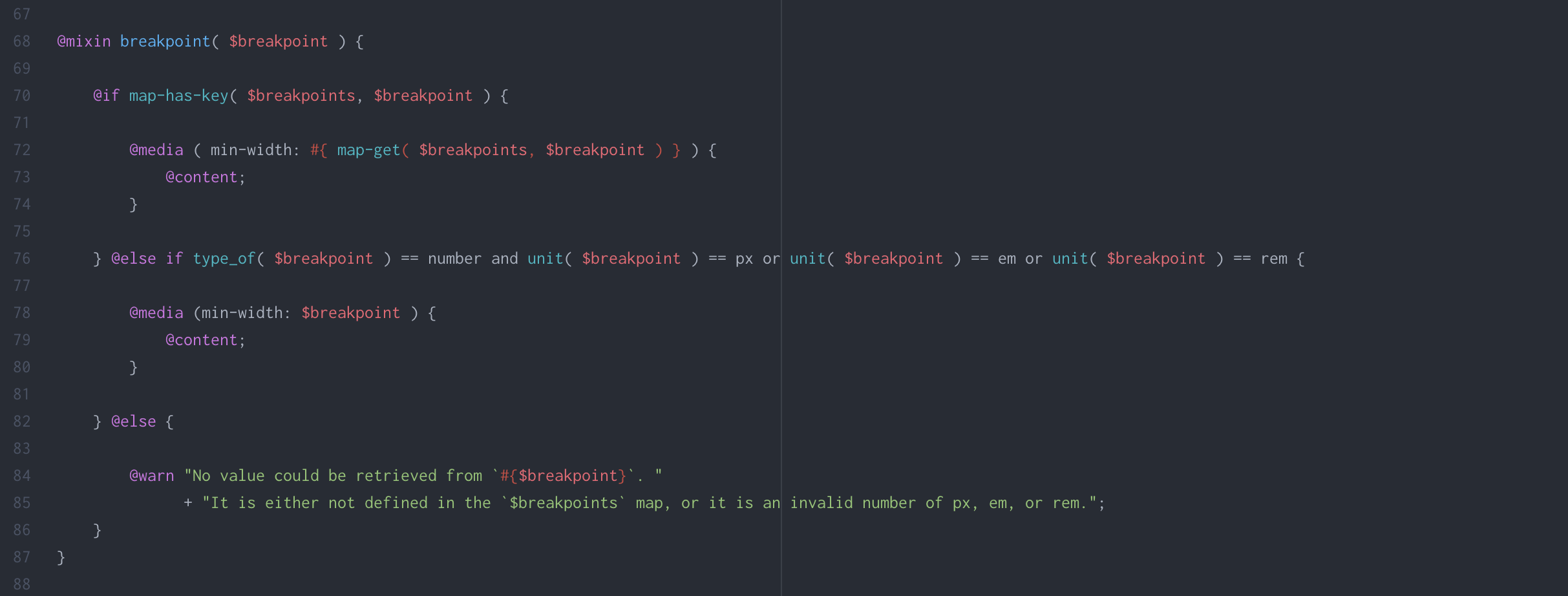
Responsive Breakpoints in Sass
TIL
Dec 18, 2017
How to structure responsive breakpoints in Sass, with examples.
Read more…
: Responsive Breakpoints in Sass

 Read more…: Responsive Breakpoints in Sass