
Up until last week, Sass breakpoints were a bit of a mystery to me. I finally figured out how they work.
First, they are programmatically generated. Define the breakpoints as a map. I use the list here.
$breakpoints: ( xs: 512px, sm: 768px, md: 896px, lg: 1152px, xl: 1280px );Next, use a mixin and expressions to build the media queries. I use min-width. I leave it as an exercise for the reader if you wish to reverse this to use max-width instead.
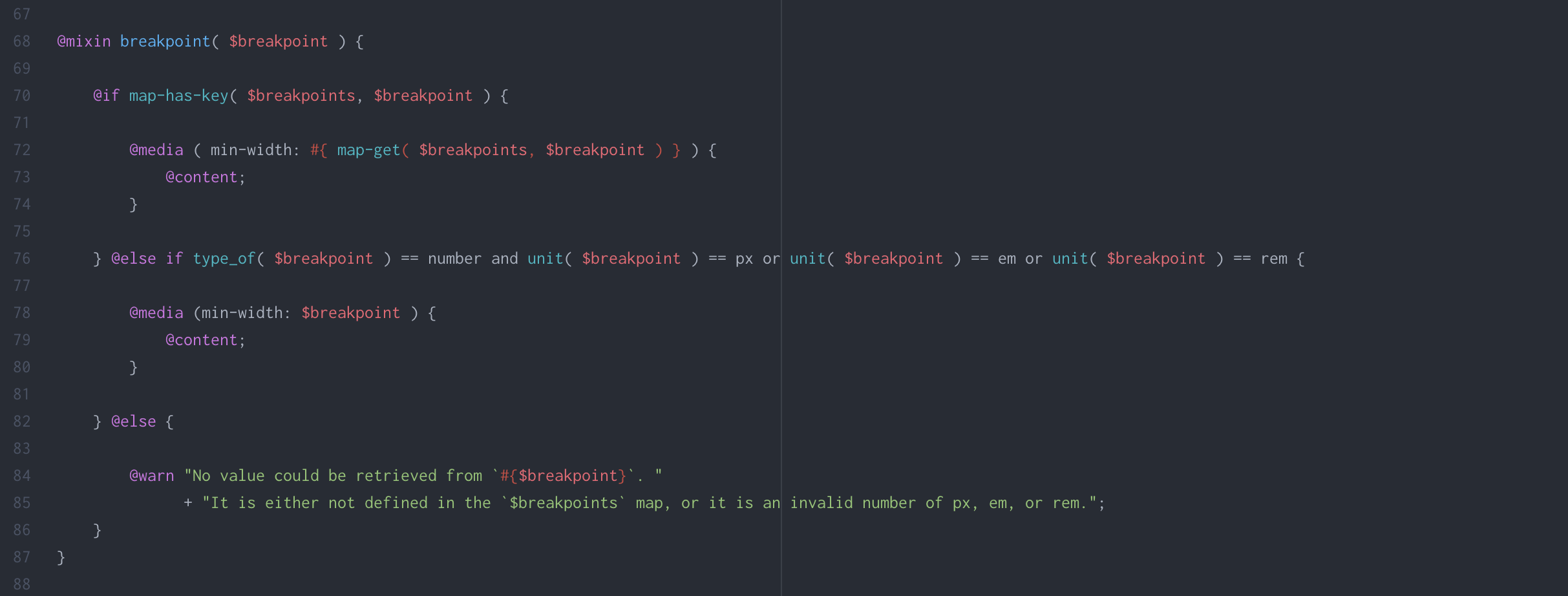
@mixin breakpoint( $breakpoint ) { @if map-has-key( $breakpoints, $breakpoint ) { @media ( min-width: #{ map-get( $breakpoints, $breakpoint ) } ) { @content; } } @else if type_of( $breakpoint ) == number and unit( $breakpoint ) == px or unit( $breakpoint ) == em or unit( $breakpoint ) == rem { @media (min-width: $breakpoint ) { @content; } } @else { @warn "No value could be retrieved from `#{$breakpoint}`. " + "It is either not defined in the `$breakpoints` map, or it is an invalid number of px, em, or rem."; } }To use, define your breakpoint styles using @import. Here is an example defining H1 font sizes at three different breakpoints:
h1 { text-transform: capitalize; @include breakpoint(xs) { font-size: 2.2em; } @include breakpoint(sm) { font-size: 2.7em; } @include breakpoint(xl) { font-size: 3em; } }

Leave a Reply